
An AI clipart generator is most useful when you need a small family of illustrations that look like they came from the same designer—not a pile of unrelated attractive images. Imagine creating a tea-shop menu with a kettle, mug, tea leaf and pastry. Each asset should share a palette, outline weight, perspective and transparent background. This guide shows how to write the visual brief, generate a controlled set, correct it, and export usable files without assuming that a generated PNG is automatically a clean vector.
Define the output: a reusable family, not four random pictures
Write an asset inventory before generating anything. For the tea-shop example, list a teapot, cup, leaf and croissant, with the same view angle and minimum clear space. State where they will appear: on a website, printed menu, small price label and social post. A matching group saves more editing effort than selecting four beautiful but incompatible single images.
Decide whether the destination truly needs editable vector paths. A flattened PNG can be perfect for social media, while a packaging vendor may want SVG or PDF artwork that can be recolored. Generative image output is often raster, even when it looks like vector art. Do not call it editable SVG until it has been exported and its paths inspected.
Create a compact style specification that a human can check
Use constraints that can be observed. For example: two-color teal and cream, rounded line ends, uniform thick dark outline, front three-quarter view, no gradients, quiet negative space and no embedded letters. Include an example reference that you own or may reuse. Ask for each item on a plain background, with centered alignment and no contact shadow. This is easier to approve than the vague instruction “cute minimal icons.”
Adobe Firefly’s style reference controls can guide aesthetic similarity using an uploaded reference and a strength setting for supported Adobe models. A style reference is not a guarantee of identical line weights or palette. Measure those visually after generation.

Generate a master item, then adapt the set
Start with the teapot because it has a distinctive handle, lid and spout. Approve one rendition for shape, stroke and colors before making the mug, leaf and pastry. Keep the same framing language in every brief, changing only the object noun and one or two object-specific facts. Otherwise a generator may turn your third icon photorealistic or add shadows that the others lack.
Save the chosen teapot as the visual target. If the tool supports image or style references, use that asset as guidance; if not, copy the written style spec verbatim. Compare all four items side by side rather than in separate tabs. Look for mismatched highlights, slanted baselines and outlines that vary with object size.
Get real transparency and remove edge artifacts
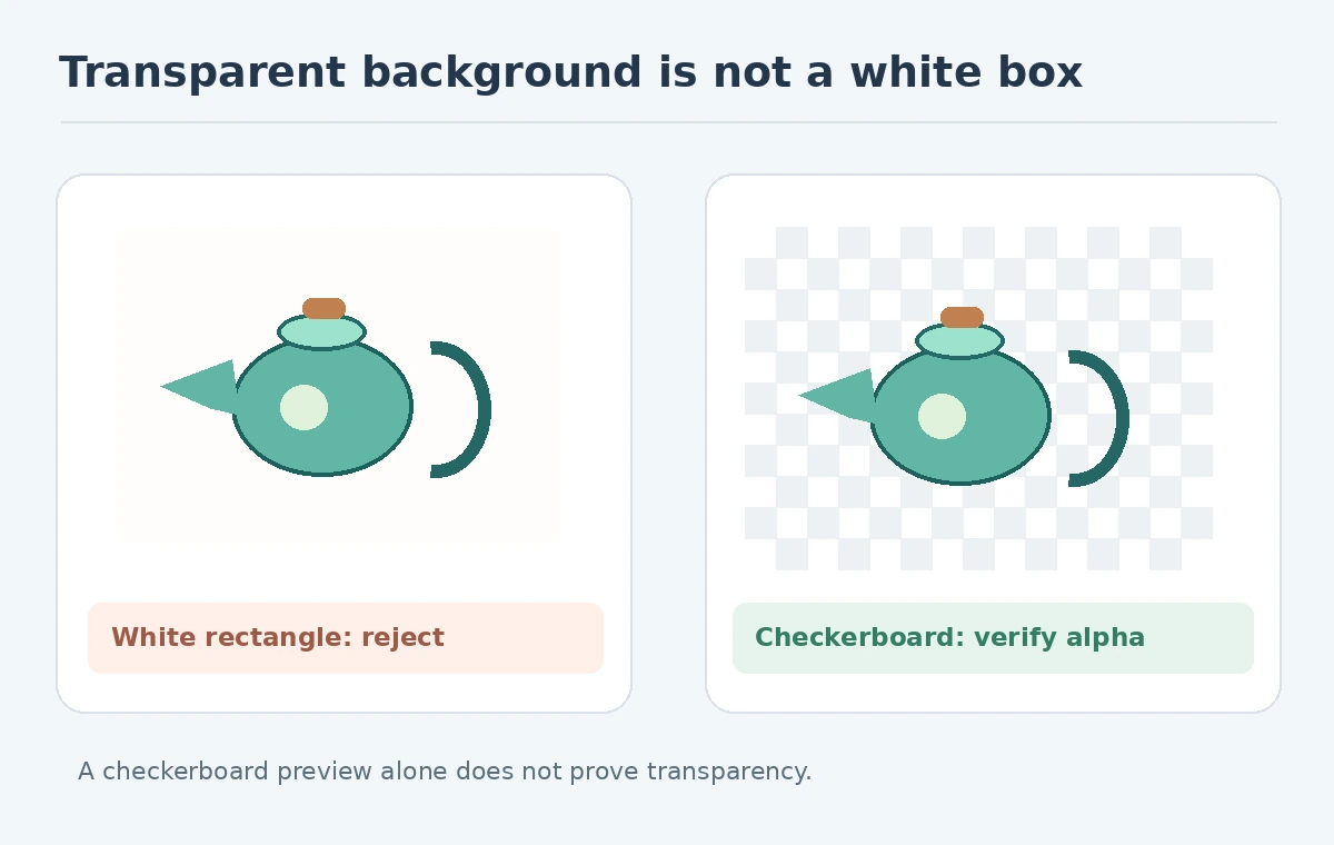
A checkerboard printed inside the image is not transparency. Inspect the file’s alpha channel in an image editor, then place the icon over both light and dark backgrounds. The edge should not carry a solid white halo, unrelated pixels or a soft rectangular glow. Hairline objects such as a tea-leaf stem need particular care when masking.
If your generator does not export transparency, use a controlled background-removal operation and inspect the result at 100% zoom. Avoid automatically erasing pale parts of the pastry because they resemble the background. Do not rasterize tiny fine lines into an icon destined to display at only 32 pixels; simplify them first.
Decide between PNG, vector tracing and redrawing
A transparent PNG preserves the approved look but scales only within its pixel limits. If SVG is genuinely required, trace the image with an illustration tool and edit the resulting paths. Check whether a smooth teapot handle has become hundreds of jagged nodes. Reduce unnecessary points and ensure the fill and stroke layers are predictable. A vectorized bitmap can be harder to work with than a hand-redrawn simple shape.
For web delivery, keep named export variants such as a large master PNG and a smaller optimized icon. Verify the actual pixel dimensions and transparency in the file, not just the file extension. Store the editable source separately, with the asset’s original prompt and any reference-image permissions.

Run a four-object consistency and legibility review
Make a contact sheet of the four icons at native size, then at the smallest planned use size. Review all at the same visual height so stroke widths can be compared fairly. Is the teapot spout identifiable? Does the pastry still look like a pastry at 48 pixels? Does the leaf use the same shadow treatment as the cup? A mismatch may require a focused redraw, not another generation of every item.
Also check against accidental trademark shapes or copied branded marks. If this is a commercial set, confirm the generator’s current terms and any client licensing constraints before distribution. A tool calling something “royalty free” does not by itself establish exclusive rights or trademark clearance.
Deliver a clipart asset pack that editors can maintain
Supply one approved master per object, small PNG variants, optional cleaned SVGs, a palette swatch and a short usage note. Include a transparent-background test and the example placement on a printed or digital layout. These are the concrete acceptance artifacts; a text prompt alone does not let a future editor reproduce the result reliably.
The fictional tea-shop pack passes when the four icons share consistent outlines and a stable palette, remain recognizable when reduced, and have truly transparent edges. It fails if one file contains a white box, a cup has a different perspective, or a traced vector is so tangled that it cannot be edited. This is a proposed QC process, not a claim that we tested a particular generator.
How We Research
We consulted Adobe’s style-reference instructions and W3C’s image accessibility guidance on October 27, 2026. The tea-shop icons are constructed illustrations of a workflow; no provider accuracy, exclusivity or export success rate was measured. We used named vendor pages for capability claims, not performance measurements; our accept-or-reject examples are editorial review criteria applied to deliberately fictional drawings.
Frequently Asked Questions
No. Inspect the alpha channel; a checkerboard-looking image can still have an opaque background.
You can trace and clean a raster image in a vector editor, but that is not the same as receiving clean native vectors.
One representative item and a short palette-and-stroke specification make later consistency checks easier.
Residual background pixels or poorly refined masks create visible halos; inspect over both colors.
No. Tool permissions, originality and existing marks require separate review.