
A small textile collection is filming a short explanation of three handwoven sample swatches. One clip was shot under cool daylight and another under warm exhibit lamps. CapCut’s AI Color Correction may bring footage closer to a consistent viewing experience, but the wrong adjustment could turn a blue-green thread into bright turquoise and alter the record of the object.
This walkthrough follows CapCut’s own descriptions of auto color adjustment alongside manual controls such as exposure, HSL and curves. It is a hypothetical museum editing example, not a claim that these particular fabrics were filmed or that CapCut produced the depicted outputs. Color fidelity must be checked against a reliable real-world reference.
Create a color reference before editing
Start by writing down the collection’s authoritative color description and photographing a neutral card or known swatch under the same light when possible. A screen grab from a previous compressed social post is not a trustworthy color standard.
Record the room lighting and camera settings for each clip, including whether automatic white balance shifted during a pan. If the textiles are irreplaceable, do not use generated color as evidence about dye composition or conservation condition. Keep the original camera files unchanged.
Separate exposure mismatch from artistic grading
Choose a representative frame from each lighting setup. Determine whether the problem is simply different exposure and white balance or whether the curator wants an intentional atmospheric grade. For collection documentation, the first goal is a consistent, neutral representation. Keep the woven fabric, a neutral background and the same color reference in view during a comparison. A pleasing warmer image is not automatically more accurate, especially if the adjustment makes undyed fiber yellow or erases differences between neighboring threads.

Find the automatic color tools in CapCut
CapCut documents importing video to a timeline, using its color and adjustment controls, and applying automatic color correction in supported versions. Its web color-grading guide points to Basic and Color adjustment, while its mobile documentation describes Adjust and Auto adjust.
Interface names and availability can change by platform, so inspect the editor actually in use. Apply an automatic adjustment to a duplicate clip or a reversible edit, then review the change at the same playback position and zoom as the source.
Use manual controls for the exceptions AI misses
If one section is too cyan while the neutral chart looks right, check the HSL hue and saturation controls rather than applying a global warm filter. If highlights on a glass display cover are clipping, adjust exposure or curves independently of overall color cast. Save versions with descriptive names such as “neutral baseline” and “curator review,” not “perfect colors.” An automated model sees pixels but does not know the object’s documented dye recipes, nor whether the image is being used as artistic promotion or evidence.
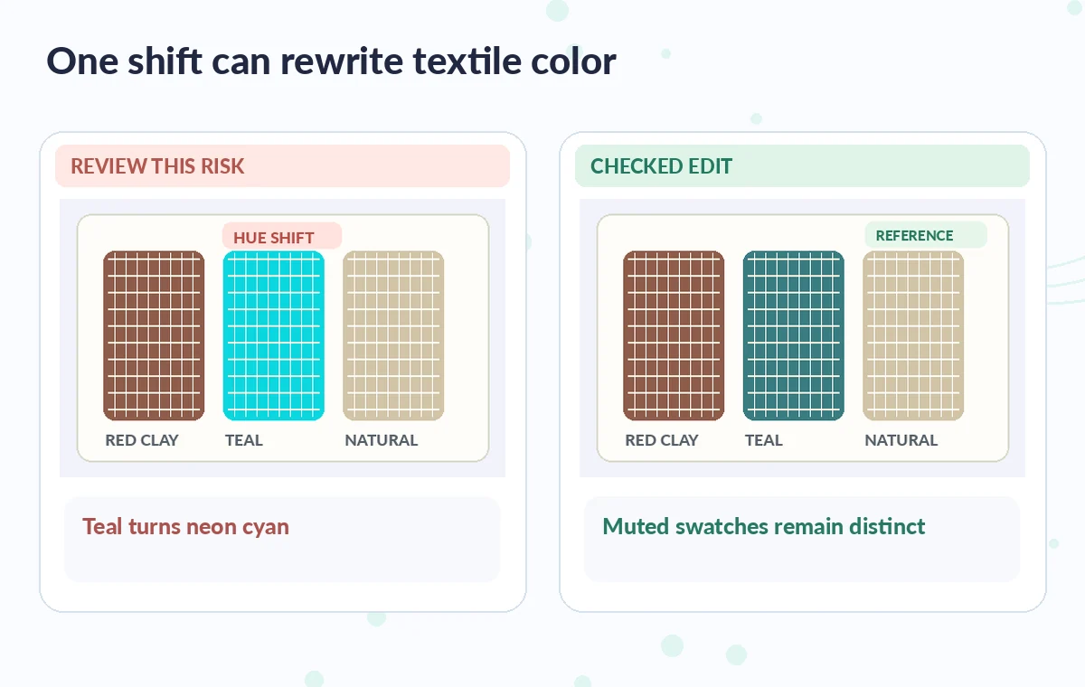
Compare three swatches without assuming the monitor is exact
Inspect the red-brown, indigo and undyed swatches at the same timeline position before and after correction. Check whether subtle stripe boundaries remain visible and whether the color hierarchy matches the curator’s reference.
Be aware that a laptop with Night Shift, HDR tone mapping or an uncalibrated display can make comparisons misleading. If exact color matching is critical, use a documented color-managed workflow and appropriate viewing hardware; a CapCut screen preview alone cannot certify that a physical sample has been represented precisely.
Check transitions between lighting conditions
Play the full sequence through the cut between daylight and the warm exhibition room. A correction that improves each still may produce a visible color jump in motion, particularly around hands, wall paint and pale fiber.
Watch for sudden skin-tone shifts or aggressive local contrast that falsely emphasizes weave defects. Keep an adjustment log showing which clip received an automatic change and which received a small manual correction. The log helps another editor reproduce or reverse the grade rather than guessing what happened.
See how AI tools work together
Build a review diagram around the actual failure mode
In an educational comparison, the risky example should show one blue-green swatch shifted toward neon cyan while neutral paper stays similar; the reviewed version should retain distinct, muted threads. The illustration must not pretend to be a captured CapCut result or measured color target. Have a collection specialist examine the final rendered video, not only the editor display, and ask whether the voiceover makes any unsupported claim about age, provenance or dye chemistry.
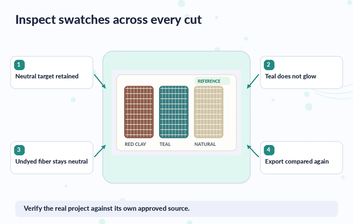
Export with a documented color decision
Choose consistent export resolution and frame rate, confirm intended color settings in the delivery pipeline, and view the exported file on another representative display. Check titles, captions and crop boundaries.
Save the untouched clip, the swatch reference, a short adjustment note and the accepted export. If colors cannot be represented responsibly, explain that the video is illustrative and refer researchers to authorized color-calibrated collection records. AI color correction should assist communication, not silently rewrite the appearance of cultural objects.
How We Research
This guide was prepared on November 4, 2026 by reviewing the official documentation CapCut: Video Color Correction and CapCut: Color grading controls and CapCut: Change colors in video. We checked the named function, the developer-described entry points, editing choices and relevant limits, then applied those facts to a clearly hypothetical editorial scenario. No live account, subscription plan, customer data, software processing run or performance benchmark was used to claim real-world results. Every illustration is original conceptual teaching art rather than a screenshot, measured before-and-after test, or verified output. The publisher should confirm current menus and entitlements, check the actual output against independent authoritative project records, and obtain the necessary human approval before release.
Frequently Asked Questions
CapCut documents automatic or AI-assisted color adjustment alongside manual grading controls; names and availability vary by editor platform.
No. Use a documented reference, controlled lighting and qualified human review rather than treating an automatic grade as evidence.
CapCut describes color adjustments, HSL, curves and related controls in its web and desktop guides; menus may differ on mobile.
Not automatically. Clips from different lighting conditions may need separate corrections and a transition review.
Compare the export with the source and the approved reference using appropriate displays, then confirm swatch distinctions and neutral areas remain believable.