
An AI book cover generator is best treated as an illustration assistant, not the final typesetter or printer. For a fictional mystery called The Glass Harbor, we will create an original lighthouse scene, add the title and author name in a conventional layout editor, and proof the result for a Kindle eBook. A paperback requires an additional wraparound cover with page-count-dependent spine and bleed. Mixing those deliverables leads to rejected files or tiny illegible type.
Start with genre, promise and visual hierarchy
Write a cover brief that readers can identify in one glance. The Glass Harbor is a quiet coastal mystery, so use a single lighthouse, dark sea and one illuminated window. Put the title at the top in a high-contrast area and reserve a lower area for the author. Avoid crowding the cover with every plot symbol. A good brief gives the illustrator a scene, palette and emotional direction.
Check other covers in the intended genre for broad conventions without duplicating a recognizable design. An AI image that happens to resemble existing copyrighted cover art should not be approved automatically. Keep drafts with unique compositional choices and a record of your reference permissions.
Generate artwork without embedded title text
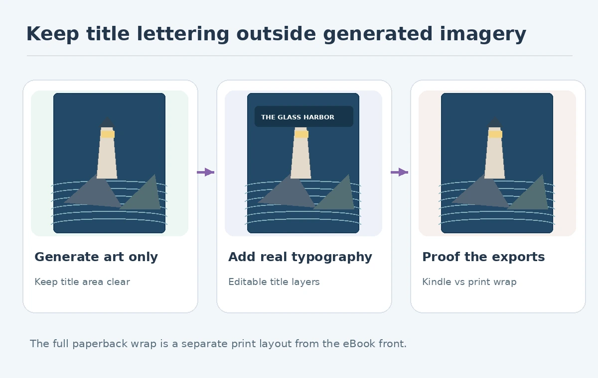
Ask the image model for the lighthouse painting with an intentionally quiet region for title placement. The prompt can specify a vertical frame, deep navy tones, a single golden window and soft sea mist. Request no words, letters or faux publishing badges in the illustration. Generated lettering is often difficult to edit and may fail small-size legibility even when it looks acceptable in a full-resolution preview.
Choose the best composition and inspect the horizon, lighthouse structure and light source. A strong scene should stay meaningful without words. Keep that clean artwork as a separate layer or file; you will need it again if the publisher changes the book title or edition.
Typeset the actual title, author and series information
Use real editable text layers in a layout program. Test the title in two lines and one line, with contrast against both the dark sky and the glow. A small author line can be readable at full size but disappear in a store listing. If a subtitle is important, give it a clear scale rather than stuffing it into the illustration.
Zoom to the likely storefront thumbnail and ask an uninvolved reader to identify the title. Consider a different font or stronger contrast before enlarging decorative symbols. Avoid placing essential words within the trim or bleed region of a print cover. Do not use unlicensed fonts simply because they are already installed on a computer.
Prepare the Kindle eBook marketing cover correctly
Amazon KDP’s current eBook cover guidelines recommend a portrait image 1,600 pixels wide by 2,560 pixels high, with JPEG preferred and RGB recommended. The help page also lists accepted formats and upload limits; always confirm them again at upload. A screenshot of a web mockup does not replace the actual export file.
Build the front cover at the intended pixel dimensions rather than stretching a small generated image until it fits. If the art lacks sufficient detail, return to a larger source or carefully assess a controlled upscale. Confirm color mode and title visibility on mobile. The KDP store marketing image is uploaded separately from book interior content.
Build a different file for a paperback
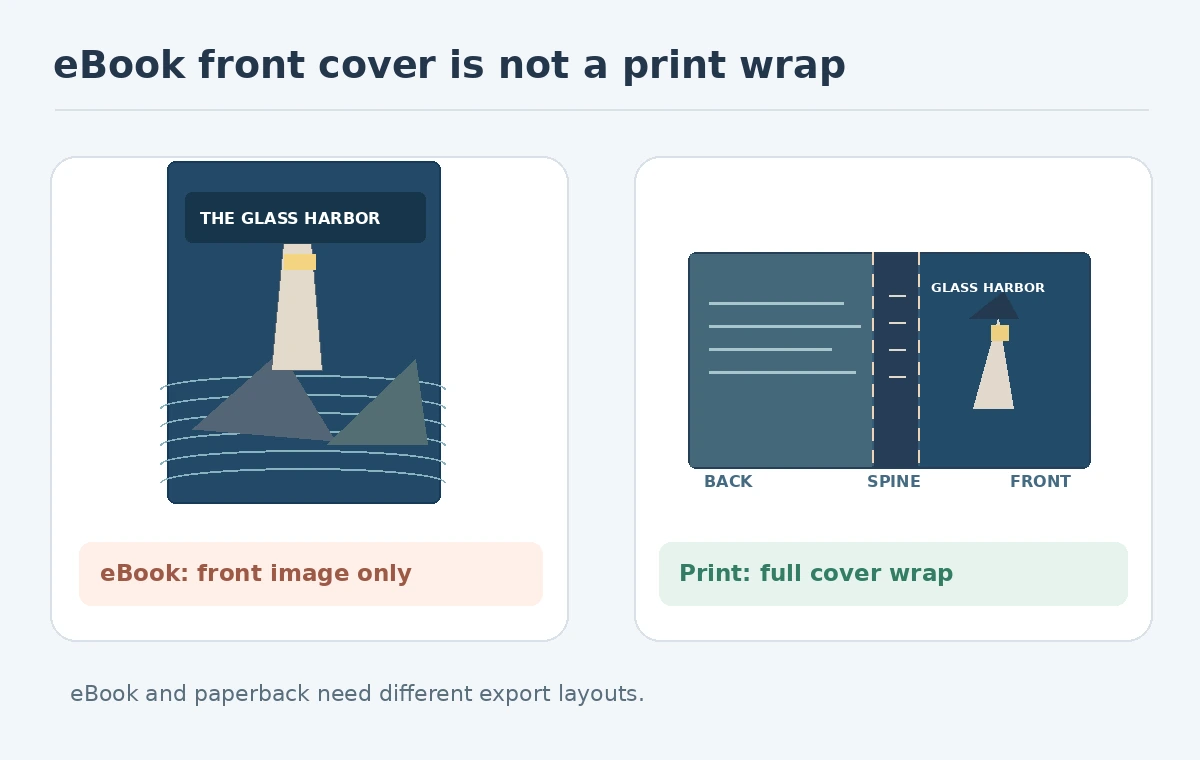
A paperback wrap includes back cover, spine and front cover on one continuous page. The spine width depends on trim size, paper selection and final page count; it cannot be guessed from the eBook cover. KDP’s paperback cover instructions provide a calculator and template generator. The stated standard bleed is 0.125 inch on outside edges and non-bleed content should remain at least 0.25 inch from the outside edge.
Work from a publisher-generated template for the final edition. Put the lighthouse painting within the front region, extend backgrounds through the bleed and protect text from trim. Verify barcode placement and whether spine text is permitted at the actual page count. An image with fictional spine dimensions is a mockup, not a press-ready proof.

Proof covers at two scales and on two backgrounds
Review the Kindle front cover at full resolution for halos, building geometry, compression and accidental text. Then display it at a small catalog-thumbnail size to assess recognition. A contrast problem can appear only at that scale. For a print wrap, examine seam alignment, barcode clearance, bleed and spine position against the exact template.
Keep a pass-fail sheet: clean source art, editable words, readable title, correct front cover dimensions, correct export mode, and a separate approved print file where applicable. Do not interpret a successful file upload as editorial or legal approval of imagery.
Track provenance, rights and revision decisions
Preserve source prompts, any uploaded reference images, typography licenses and a version label for the approved edition. KDP’s cover guidance instructs publishers to have rights needed for their uploaded content. Read the applicable AI service’s current usage terms as well; a commercial use allowance is not a guarantee that a similar existing work does not exist.
The Glass Harbor example passes if its lighthouse scene is recognizable, title remains readable as a thumbnail and the eBook and paperback export requirements are treated separately. It fails if the title is baked into a flawed AI raster, if the cover uses another book’s artwork, or if a front-cover JPEG is presented as a complete paperback wrap.
How We Research
We checked Amazon KDP’s Kindle marketing-cover guidelines, paperback cover instructions and cover rights guidance on October 27, 2026. The lighthouse title and artwork are fictional examples; no print-provider preflight or actual KDP upload is claimed. We used named vendor pages for capability claims, not performance measurements; our accept-or-reject examples are editorial review criteria applied to deliberately fictional drawings.
Frequently Asked Questions
The illustration may be reused, but a paperback needs a separate full wrap with spine, back cover and bleed.
Its current guidelines recommend 1,600 by 2,560 pixels for a portrait marketing cover.
Keep title typography in editable text layers for correction and reliable legibility.
Use the KDP cover template calculator with the final trim size, page count and paper settings.
No. Verify sources, tool terms and any potentially similar protected imagery separately.