
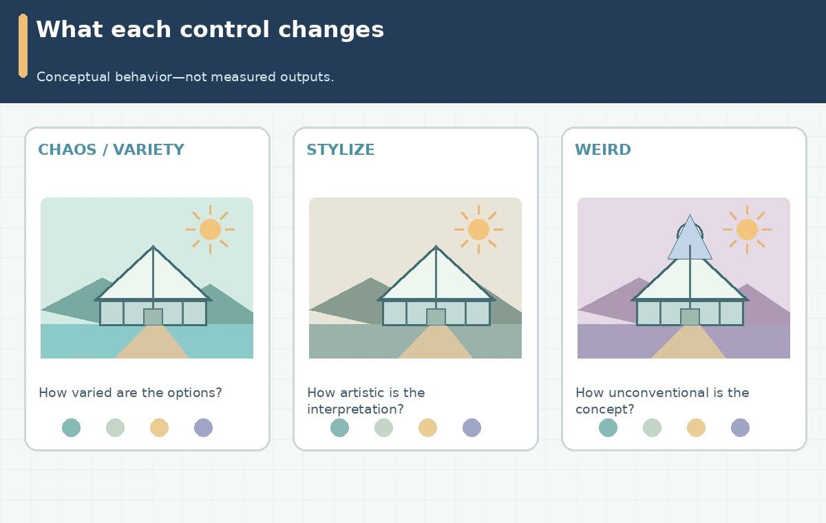
Midjourney offers several controls that can change the look of a generation, but three commonly confused settings answer different questions. Chaos, also called Variety, changes how diverse the initial results may be. Stylize changes how much of Midjourney’s artistic interpretation comes through. Weird explores unusual ideas. This guide uses a fictional editorial image of a glass greenhouse beside a lake to build a fair comparison. It is a controlled planning method, not a claim that LabFin performed live model tests or that any particular parameter guarantees a pictured outcome.
Define the decision before touching a slider
Start with a one-sentence decision: “Find an appealing hero illustration of a lakeside greenhouse that remains recognizable, leaves room for a headline, and does not invent lettering.” Specify the subject, key objects, aspect ratio, editorial use, and a permitted range of aesthetic novelty. Make a small acceptance rubric: greenhouse visible, horizon coherent, title-safe area empty, and no accidental logos. If you change subject, color palette, aspect ratio, and parameter at once, you will not know what improved the result. Take note of the model version; the official Version guide identifies V8.2 as the current default and explains that some editing controls differ from earlier generations. Do not copy older V6 or V7 screenshots as if they describe today’s menu.
Know what Chaos, Stylize, and Weird actually influence
Midjourney documents three distinct controls in its Controls reference. Chaos or Variety is about the spread among results, not a promise of better quality. Stylize adjusts how strongly the system’s visual preferences affect the interpretation of a prompt; it is not a factual-accuracy setting. Weird steers toward more unconventional imagery. A low-chaos result can still be surprising, and a high-stylize result may alter an important object. Use the names of controls in your worksheet and record the settings actually shown in the version you use. Resist using invented fixed thresholds or claiming that a numeric setting has the same visual effect with every prompt or model update.

Build a three-pass variation matrix
Create a baseline prompt naming only the scene and delivery constraints: “glass greenhouse at the edge of a calm lake, single footpath, distant mountains, wide composition, clean space on the left for a headline.” In pass one, leave the style controls at your current defaults and change only Chaos across low, middle, and high settings supported by your interface. In pass two, choose a promising composition, return Chaos to baseline, and vary Stylize alone. In pass three, hold the chosen composition brief and compare ordinary versus more unusual Weird settings. Save prompts, model version, visible settings, and thumbnails in a grid. It is a *proposed evaluation protocol*: there are no measured quality scores or generated comparison results reported here.
Keep the prompt and aspect ratio comparable
The number of words in a prompt can obscure why an image changed. For a fair sweep, retain the same subject nouns, geographic relationships, camera direction, and empty headline zone. Do not add a dramatic storm to only one row or remove the greenhouse from another. Export the candidate at the same target aspect ratio, then view the image both full-size and in the intended website crop. A parameter may look fascinating in a standalone square but fail if the page needs a wide banner. Note any action taken with variations, zooming, or upscaling separately; those are additional stages, not evidence that the control itself improved composition.
Read the grid as a decision map, not a leaderboard
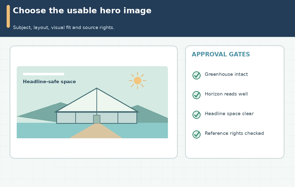
Assess every candidate against four gates: subject intact, layout usable, visual character appropriate, and editing risk acceptable. Use three labels—pass, revise, reject—rather than percentages that suggest empirical scoring. Imagine a version with an exotic greenhouse silhouette that looks striking but removes the door: that is a rejection for a realistic architecture article, even if it would suit a fantasy poster. Conversely, a conservative candidate that leaves readable negative space may be more useful for a marketing hero. Keep a short “why” beside every selection so collaborators can make the same decision without needing to remember a subjective preference.
Avoid confusing variety controls with consistency tools
A Style Reference, Personalization profile, or edit workflow addresses different production needs. If your task requires a branded series, settle the creative direction first, then use a consistent style control and a human visual checklist. If the job requires an exact storefront, building, or person, a creative parameter is the wrong evidence of identity preservation. The Style Reference guide explains that references convey visual style rather than copying an object. In other words, creative exploration and asset fidelity should occupy different columns in your approval sheet.
Hand off an approved, editable asset
Deliver the chosen image with the original prompt, version, parameter values, and a note about where text will be set in the web page rather than baked into the pixels. Check thumbnail readability, full-size edge artifacts, and any visible lettering. If a client supplies a reference, confirm permission to use and publish it. A revision request should say which gate failed: “keep the greenhouse shape and clear left margin, but reduce visual novelty.” This makes the next round concrete and less expensive than restarting with vague adjectives. Do not imply a generated greenhouse represents a real location or a verified architectural design.
How We Research
We checked Midjourney’s live Controls index, Parameter List, and Version compatibility information on October 28, 2026. The worksheet is an editorial method inferred from parameter roles, not a comparative benchmark; no first-hand generations or numerical performance claims are made. The visuals are original conceptual explanations, not screenshots or measured experiments.
Frequently Asked Questions
No. Chaos addresses result diversity, not a guaranteed increase in fidelity, resolution, or composition quality.
No. Stylize affects Midjourney’s own artistic interpretation; a Style Reference supplies an external look or style code.
No. It is a creative-novelty control, not a tool for preserving exact object identity.
Holding the subject and crop stable makes differences easier to interpret and reduces accidental prompt confounders.
No. The illustrated grid is conceptual; use and label your own actual results for real comparisons.