
Midjourney aspect ratio controls the shape of the frame, not the physical size or final print resolution. That distinction matters when a landscape generation must become a desktop homepage hero and a narrow mobile card. This practical workflow follows an illustrated lighthouse on a coastal headland. It keeps the lighthouse and its beacon in the usable crop, while reserving negative space for real HTML headline text. The examples and drawings below are conceptual layout exercises, not screenshots or claims of Midjourney test results.
Choose the delivery frames before writing a prompt
Start with the actual content placements: a 16:9 desktop art area, a 4:3 tablet card and a 9:16 vertical mobile story, if those are genuinely the channels your design uses. Do not simply create one artboard and assume its edges are safe everywhere. Put the lighthouse on the left third in the wide hero so the title can sit on the right; for the story, make a second composition or crop that retains the tower. Sketch clear keep-out margins for platform overlays, navigation and captions. The official Midjourney aspect ratio guide explains the `–ar` and `–aspect` syntax and notes that a new image defaults to a square. Use ratios to shape subject placement; use actual pixel dimensions later for delivery. This separation prevents a frequent mistake: requesting a wide image and discovering that the important object must be cut away on phones.
Write one prompt with one deliberate aspect ratio
An example brief is “coastal lighthouse on a rocky peninsula at blue hour, clear water, atmospheric clouds, subject on left third, open sky on right for headline, editorial illustration –ar 16:9.” The parameter goes at the end; Midjourney accepts whole-number pairs, not decimal aspect ratios. Its documentation shows that 1920:1080 simplifies to 16:9. Keep the same subject description while exploring composition, because changing several ingredients at once makes comparisons uninformative. Inspect the generated options for empty headline space, believable horizon position, lighthouse silhouette and the separation between the beacon and background. This is not a request to render the headline into the AI image. Real page text should remain an editable accessible overlay, so layout and typography do not depend on image-generated lettering.

Understand what –ar does not promise
An aspect ratio is width divided by height; it is not a guarantee of an output such as 1920×1080 pixels. The Midjourney Upscalers page gives version-specific SD, HD and upscaled pixel dimensions, and explicitly warns that final sizes vary by version, ratio and upscaler. It also warns that certain HD images cannot be upscaled further with the current tools. Do not copy old pixel counts into a timeless checklist. For an actual build, download the chosen result and read its real width and height before sizing, compression or printing. Extreme aspect ratios may be experimental and less predictable according to Midjourney. If a publication needs very unusual proportions, prepare a safer normal-width master and leave crop or extension options for the final design step.
Build a crop map rather than relying on intuition
Set up rectangles matching each delivery placement over a copy of the selected wide illustration. Mark the lighthouse top, base, shore horizon and intended headline area. The 16:9 version may leave ample sky; a centered 4:3 crop reduces both sides; a 9:16 crop could lose the lighthouse entirely if it stays at the far left. Choose a second vertically composed generation when the crop cannot work. Record the focal point as coordinates relative to the artboard so another editor can reproduce it. A spreadsheet can store placement name, target aspect ratio, focal point, minimum subject margin and approval status. No AI tool can decide automatically whether a cut-off railing or lost beam changes the story, so make a visual editorial check part of the deliverable.

Proof text contrast, responsive behavior and accessibility
Place headline, navigation and action text in the real site mockup, not inside the generated illustration. Test contrast on the brightest cloud and darkest water; a translucent overlay may be safer than hoping each image generation provides a consistent blank area. Review at desktop, tablet and narrow phone widths, including browser font scaling. Keep the lighthouse clear of the main clickable controls. Write alt text that describes the picture and its purpose, avoiding repetition of visible headline copy. Compress exports and test page loading without sacrificing subject legibility. For decoration-only backgrounds, consider whether empty alt is appropriate for the final HTML implementation. The image should support content rather than becoming the sole carrier of essential information.
Hand off a documented master and crop variants
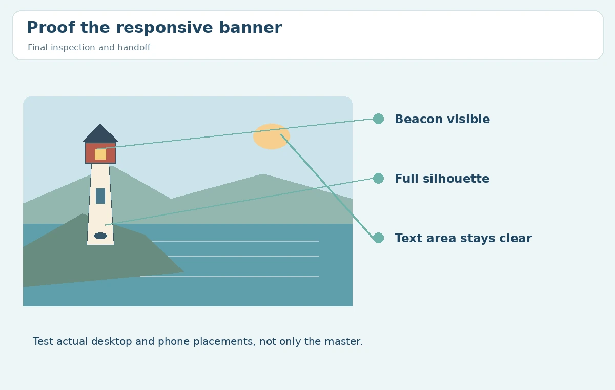
Preserve the original downloaded file, record its aspect ratio and measured pixels, and export a separate crop for each approved placement. Put a simple crop diagram beside the final examples: desktop uses the wide composition; tablet is an approved center-left cut; phone needs a separately composed tall version. Name and version files in the project asset system rather than printing production codes on the artwork itself. Review the final image beside live copy before release, particularly near the outer safe margins. This workflow yields a reusable art direction brief and an audit trail, not a claim that `–ar` guarantees perfect responsive artwork. When a new placement appears later, start from the master rather than enlarging an already compressed crop.
How We Research
On October 28, 2026 we checked the official Midjourney aspect ratio documentation and its Upscalers reference. The former establishes syntax and ratio restrictions; the latter clarifies variable pixel sizes and version-specific limitations. The lighthouse, layout rectangles and approval criteria are conceptual examples developed for this article. We did not run Midjourney or measure visual outputs. Check the currently selected model and final downloaded file for any production project.
Frequently Asked Questions
No. The ratio defines the frame shape; downloaded pixel dimensions depend on model and output mode.
No. Midjourney documents whole-number pairs, so use 3:2 instead.
Keep important text in editable webpage elements for accessibility, responsiveness and corrections.
Sometimes, but a separately composed tall version is safer when the subject leaves the crop.
Measured pixel dimensions, focal-point visibility, text contrast, accurate alt text and every real placement.