
A public library wants a bookmark printed with tiny books, leaves, and stars. The pattern should feel lively but must repeat without visible seams across a full sheet, leaving a quiet space for the library address and a QR code. Illustrator Text to Pattern can generate editable vector patterns from text prompts, with color and density controls. It also creates swatches that can be applied to objects. This is a fictional production workflow, not a measured live tool test: it makes repeat continuity, practical print limitations, and readable information more important than selecting the first attractive AI variation.
Define the finished bookmark before generating motifs
Start with the trim dimensions supplied by the printer and set a separate safe area for the library name, phone number, and QR code. Decide whether the pattern will cover the whole background or only the top and bottom thirds. An oversized book illustration could conflict with essential text, even when the repeating tile is technically seamless. Choose a limited palette based on library brand colors and determine if two-color printing is required. Save an unpatterned master and a separate layout proof so the design can be changed without rebuilding public information or cutting guides. Do not invent print specifications when the vendor has not confirmed them.
Find the official Text to Pattern controls
Adobe’s Illustrator guidance describes selecting the object whose fill or stroke will receive a pattern and opening Object > Pattern > Generate Patterns. It also documents a path under Object > Generative and controls in Fill and Stroke panels. Confirm the current Illustrator version, the organization’s generative-credit access, and any model availability before scheduling production. The exact panel position can change. Text to Pattern makes editable vector patterns; it is not the same feature as Generative Shape Fill, which fills the interior of selected shapes. A continuous patterned bookmark has its own repeat-boundary problem and should be treated as a different workflow.
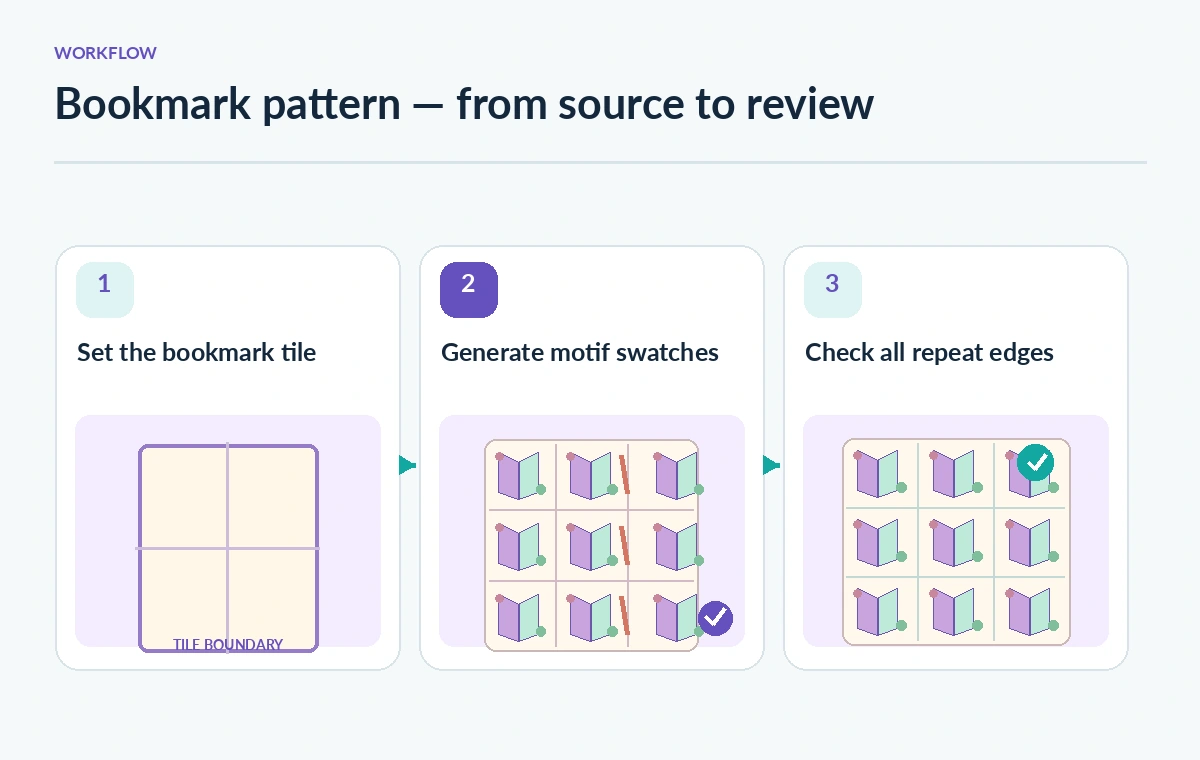
Prompt for motifs that can survive small print
A practical starting instruction is: “small open books, leaf sprigs, simple stars; flat vector shapes; generous background space; low contrast variety; no words or lettering.” Avoid adding copyrighted character silhouettes or exact imitation of another institution’s identity. Keep tiny icon details simple enough to be recognizable after printing. If the library plans to place a QR code over the art, reserve a solid quiet zone with adequate contrast; a pattern underneath the code can reduce scanning reliability. Store the prompt as a design note rather than describing it as a guarantee of a particular outcome.
Constrain color count and motif density
Adobe documents controls for color presets, a number of colors, specified palette colors, effects, and a density slider. Those settings help steer the output, but a screen preview does not certify usable spot-color separations. Try a low-density version first; bookmark art needs enough empty background around the text block. Examine whether the model generated nearly identical marks that visually merge after reduction. If the pattern becomes a gray mass on a small proof, simplify the motifs or increase spacing. Ask the printer which RGB, CMYK, or spot-color settings are appropriate for the project.
Review variations as swatches, not finished designs
Generate a modest number of options and inspect them across a larger rectangle rather than in a tiny tile thumbnail. The Adobe help page explains that generated variations are added to a Generated Patterns folder in the Swatches panel, and that linked variations are not available the same way they are in some other generative Illustrator features. Name a promising swatch clearly and preserve its initial state before editing. Judge all candidates on three factors: motif clarity, repeat continuity, and background space for readable library copy. Discard variants that use attractive objects but force awkward edges into every tile.
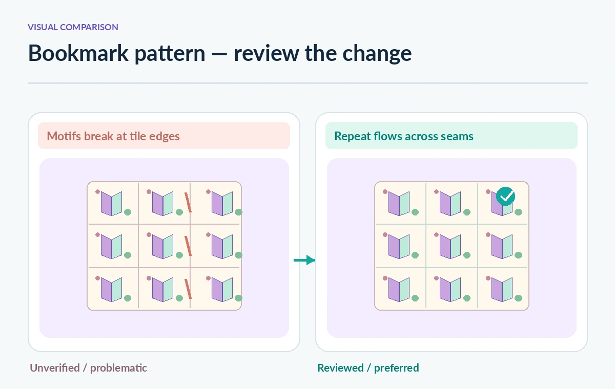
Examine four edges and both diagonal joins
Zoom in on one tile boundary and repeat that inspection at left/right, top/bottom, and corners. A book spine that stops exactly at an edge can produce an obvious vertical fence once tiled. A leaf cut at one edge may look intentional only when its matching continuation exists on the opposite edge. The before-and-after illustration here shows a bad repeated tile and a more continuous pattern; it is not a screenshot, generated output, or measured print result. Preview at least three tiles across in both directions, because a seam that is subtle on one tile can become a conspicuous stripe over a full sheet.
Edit the pattern tile without destroying the master
Adobe provides an Edit Pattern action for generated swatches and documents tile width, height, artwork-bound sizing, overlapping order, and repeat preview settings in Pattern Options. Save a duplicate swatch before changing spacing or simplifying decorative paths. The official editing instructions note that some tile-type and brick-offset controls are not editable for generated patterns, so do not promise a one-click fix for every repeat structure. Move or redraw troublesome objects manually if needed, then compare the current swatch with the archived starting version. Keep text and QR code objects outside the pattern tile to prevent accidental repeats.
Run an actual print-size and QR-code check
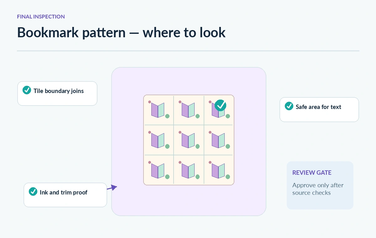
Render the design at the printer’s specified size and put the library’s approved contact text in the reserved quiet area. Check that no decorative strokes intersect type or the mandatory QR quiet zone. Print a low-cost proof at 100% scale and scan the QR code using several ordinary phones, if a code is part of the real project. Also review the design in grayscale for contrast and on a darker paper sample if appropriate. A motif may be mathematically repeatable yet visually form distracting stripes; assess overall texture from arm’s length. The guide does not claim to have performed this physical test.
Prepare the release package and keep source provenance
Ask the library communications lead to approve all wording, opening hours, and brand colors separately from the decorative artwork. Give the printer a clearly labeled export and retain the editable Illustrator document, original swatches, pattern revisions, and final proof. If a designer made manual corrections, describe those as human work rather than crediting every detail to AI. Check bleed and crop marks against the actual print template. Before ordering hundreds of copies, confirm the final tile has no visible vertical or horizontal joins and that the informational side remains readable. Repeat the quality check if the print dimensions or material change.
How We Research
This article was researched using the named official product documentation: Adobe Illustrator Help — Generate patterns and Adobe Illustrator Help — Edit generated patterns. We checked the described features, interface entry points, documented access conditions, and limitations relevant to this exact scenario, then developed a human-verification workflow. The scenario, graphics, sample material, model outcomes, approvals, and examples are editorial illustrations, not an account test. We did not operate a customer workspace, measure speed or accuracy, capture actual UI screenshots, or verify private project policies. Confirm current entitlements and instructions in the official documentation before acting.
Frequently Asked Questions
No. Text to Pattern creates repeating vector pattern swatches; Generative Shape Fill works with selected shape interiors.
Adobe says they are added to the Generated Patterns folder in the Swatches panel.
Yes. Adobe documents palette controls and a density option, but inspect the actual printable result.
No. The official edit documentation notes limitations for tile type and brick offset in generated patterns.
No. Inspect the full repeat and proof text, QR quiet zones, ink behavior, and trim at actual size.