
A park volunteer needs three signs: a water fountain, a hiking route, and a bicycle parking area. Illustrator’s Text to Vector Graphic can help explore vector pictograms, but a generated illustration is not automatically an understandable public sign. One extra arrowhead, a closed gap in a bicycle wheel, or a decorative detail that disappears at a distance can reverse the meaning. This fictional wayfinding project shows how to constrain generation, compare consistent icons, and verify the actual vector paths. The drawings are teaching diagrams; we have not generated or printed signs with Illustrator.
Write the sign requirements before prompting
Define one concept per icon and the exact purpose of each sign. The sample trail set needs a drinking-water fountain, a walking route, and bicycle parking; it does not need a landscape painting or a logo. Record a minimum viewing size, intended background color, and whether a directional arrow will be added separately. Keep arrows outside the generated icon when they communicate a physical turn, because an accidental arrow inside a pictogram could send visitors the wrong way. Make a small reference sketch of what each object must contain, such as two visible bicycle wheels and an unmistakable bottle-filling point. These requirements are hypothetical design criteria, not verified accessibility test results.
Generate one icon in a controlled Illustrator context
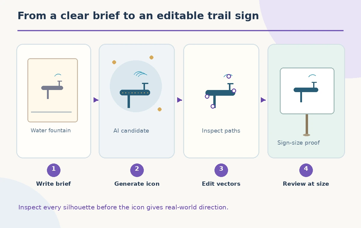
Create a rectangle on the Illustrator artboard, select it, and choose Generate Vectors in the Contextual Task Bar, as described by Adobe for Text to Vector Graphic. Choose the icon content type and write a narrow prompt: a simple single-color front-view water fountain pictogram, bold silhouette, no letters, no arrow, plain background. Generate the candidate and inspect the variations Adobe presents. Do not assume a particular model, number of variations, or credit cost is available in every account. Use the output as a starting object rather than a final asset; a visually appealing rendering can contain open shapes, stray details, or inconsistent proportions.
Establish a coherent family of pictograms
Keep the same stroke weight, corner style, fill color, negative space, and approximate visual mass across all three signs. Describe those rules again when asking for the bicycle and walking pictograms; do not depend on the AI to remember previous icons. If one symbol is dense while the others are sparse, either simplify it manually or regenerate with a tighter prompt. Put the pictograms into identical square guides so a reader can compare their scale, but keep optical centering in mind: a water fountain with a tall post may need a different bounding box from a wide bicycle. A consistent set is easier to read than three unrelated attractive illustrations.
Inspect what remains editable in the vector result
Expand the generated artwork’s layers and inspect relevant shapes in Illustrator before committing to a production file. Adobe describes Text to Vector Graphic as producing editable vector graphics, but editability alone says nothing about shape quality. Look for duplicate contours, tiny floating islands, overly complex paths, and overlapping shapes that only appear solid at a large preview size. Check the two bicycle wheels independently, preserve a recognizable seat and frame, and make sure the water-fountain silhouette does not accidentally resemble a restroom symbol. If a needed form is missing, repair that specific object rather than treating the prompt as the only possible editing method.

Test the sign at the size people will see
Print a draft or simulate an accurate on-screen scale before approving the icons. Set the pictograms against the planned background with realistic contrast and inspect them from a distance. Thin internal lines can disappear while small negative spaces fill in; that is why a clean enlarged vector outline is not enough. Compare the water icon with the bicycle icon at matching sizes and ask a colleague unfamiliar with the project to identify each without descriptive captions. The illustration here shows a hypothetical small-size failure and a simplified alternative, not results from a readability study or measurements from a printed sample.
Separate direction arrows from destination symbols
A hiking symbol indicates activity, while a directional arrow tells a visitor where to go. Keep them as separate editable components so the same hiking symbol can be reused on left-turn, straight-ahead, or right-turn signs without re-generating the icon. Align the arrow with the sign layout rather than letting the AI insert it spontaneously. Inspect arrowhead orientation and ensure it cannot be confused with a footpath or branch. This becomes especially important where bicycle and pedestrian paths diverge. The map-like diagram uses a three-way junction solely to show the difference between a category pictogram and a directional decision.
Prepare clean export assets and accessible context
Save the editable Illustrator document with appropriately named layers, and export production formats according to the sign vendor’s requirements. SVG or PDF may preserve vectors, but verify fills, clipping paths, outlines, and fonts with the actual recipient; no single format guarantees correct output for every fabricator. Pair each sign with written or contextual information where appropriate. A drinking-water symbol is not a promise about potability or current facility operations. Avoid adding a route distance, elevation, or accessibility designation unless the park authority has independently confirmed it. Treat generated graphics as designs awaiting review, not as approved public instructions.

Review the final three-icon sheet as a system
Place all three pictograms side by side in the intended colors and examine the same problem areas at identical scale. Confirm that the fountain still reads as water, the walker has distinct limbs, the bicycle has open wheel centers, and the arrows remain separate from their destinations. Ask a reviewer to look for unintended meanings as well as missing details. Keep rejected candidates in a separate working area rather than accidentally exporting them. If recognition depends on a tiny feature, redraw the symbol more simply. The success criterion is human-readable signage after review, not proof that a specific model created a flawless vector image.
How We Research
We used Adobe’s Text to Vector Graphic guide to establish the Generate Vectors workflow and the description of editable output, and its generative AI feature FAQ to distinguish text-to-vector from other tools. No live generation, print production, legibility study, or accessibility certification was performed. The trail icons and junction are original conceptual art for human-review checkpoints.
Frequently Asked Questions
No. Legibility, meaning, and physical sign requirements still need independent review.
For reusable wayfinding, keep direction arrows separate and verify their orientation in the layout.
Adobe describes editable vector results; inspect and simplify individual shapes before production.
Use identical preview sizes, backgrounds, and contrast conditions, then ask someone to identify them without captions.
No. The figures are editorial drawings showing a suggested inspection workflow.