
A public trail map uses a small icon for a shallow crossing: three dark stepping stones over a pale blue stream. A design team wants a softer shape and better harmony with the map palette. If an AI edit adds a fourth stone, viewers may misread the crossing configuration, and the revised drawing no longer matches the approved site symbol.
Adobe describes Prompt to Edit for modifying generated Illustrator artwork, including adding, removing, recoloring, and replacing elements. Its current documentation limits the feature to artwork generated using Text to Vector Graphic or Turntable. The scenario below demonstrates careful refinement of such eligible artwork. It is not permission to misrepresent a real crossing or a record of a live model experiment.
Start with the approved route meaning, not a style prompt
Collect the map legend, the approved trail symbol, the actual site description, and the palette specification. The three-stone motif in this fictional example is a designed convention, not a safety assessment of an outdoor crossing. Count the stones and note the left-to-right stream direction. If the sign has a public-safety function, confirm the final map and field signage with the responsible trail authority.
Save the original vector or reference artwork separately before any generative work. Identify which parts may change—corner roundness, stroke consistency, and color balance—and which must remain fixed: stone count, relative placement, path meaning, and high contrast at small print sizes. The visual prompt should never be the only repository of these constraints.

Confirm that Prompt to Edit applies to the selected object
Adobe specifies that Prompt to Edit is available for Illustrator artwork previously created using Text to Vector Graphic or Turntable. Do not promise that it can edit an arbitrary imported SVG through the same command. Select the eligible generated artwork and use the contextual Prompt to Edit control, or the available Edit Generated Objects command described in the official documentation.
If a previously approved icon was drawn manually and is not eligible, use standard vector tools rather than inventing a workaround. Work on a duplicate object, keep a versioned source, and record the application version. Generative credit and regional access terms can differ, so check account eligibility before making a production workflow depend on the feature.
Give the editor a narrow, verifiable instruction
Use a prompt such as “Round the edges of the existing three stepping stones; retain exactly three separated stones and the stream outline.” This asks for a local visual refinement instead of a new composition. Avoid prompts like “make the crossing more realistic,” which encourage the system to invent another rock, grass details, or water texture that may compete with the approved glyph.
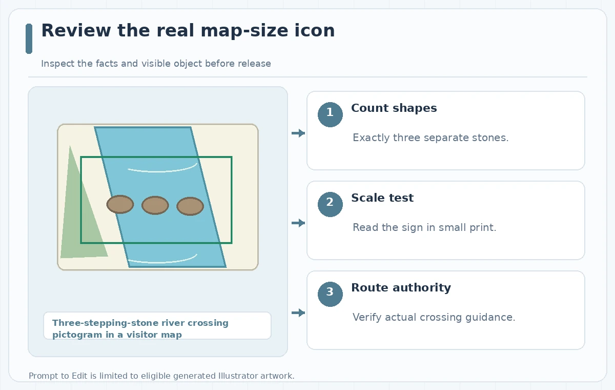
Generate one or more candidate variations, and retain the pre-edit icon for direct comparison. A candidate can be visually beautiful while representing the wrong number of stepping stones. Check the vector shapes themselves, not just a small preview; overlapping stones may appear as one at 24 pixels or become confusing when printed in monochrome.
Inspect the exact elements rather than the overall style
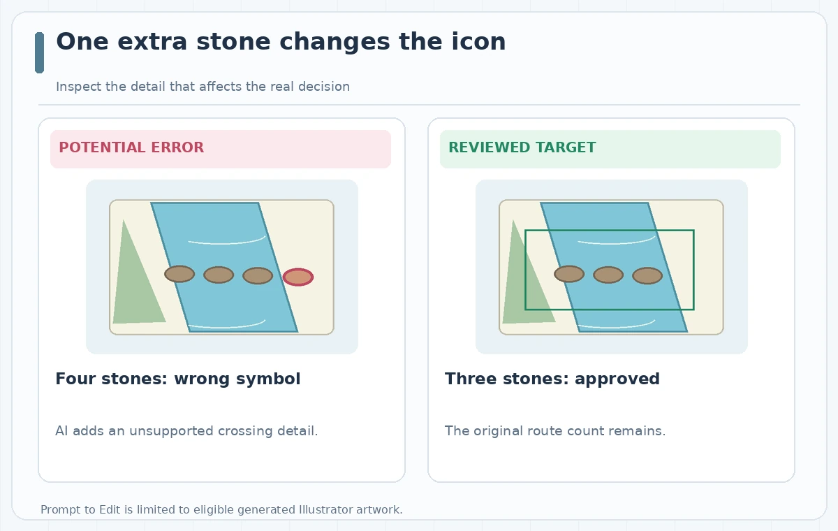
The deliberately wrong comparison adds a fourth stone downstream. The reviewed target has three separated, visible stones over the same simple stream. Count the objects, check whether a stone intersects the bank, and confirm the direction of the suggested travel path. The diagram illustrates the type of output problem to reject; it is not an actual exported Illustrator variation.
Examine fill colors and shape order. Extra decorative dots can look like stepping stones at map scale. Convert the illustration to grayscale and inspect at the size used on printed trail cards. If the meaning becomes ambiguous, edit the vector directly. AI-assisted style consistency is not a substitute for a precise symbol system.
Refine paths and test real-world legibility
Use Illustrator’s ordinary path and color tools to correct object count, line thickness, and spacing after selecting a usable variation. Keep editable vector objects where possible. Make a small-size mockup next to a label and arrow so reviewers see the pictogram in context, not isolated on a large artboard. The symbol should read clearly when placed beside other visitor icons.
Check color contrast and any reliance on hue. Print a black-and-white proof and view the symbol at the expected distance. If a route has accessibility constraints, those must be expressed through verified signage and accompanying text. A visually friendly icon cannot independently establish that a crossing is wheelchair accessible or safe at a particular water level.
Control the handoff to map production
Archive the approved source, generated candidate, manually adjusted file, and a short changelog. Mark whether the final stone count was preserved automatically or corrected by a designer. Supply a raster preview at intended size with the vector artwork, so the print team does not substitute a prior four-stone version inadvertently. Avoid leaving unapproved drafts in the shared asset folder under similar names.
If multiple maps use the icon, update the component library only after a route owner signs off. A new color palette may also change contrast against the map background. Review the icon on paper and mobile, and verify that its meaning aligns with the text legend. No automatic vector generation step guarantees field accuracy.
Publish the three-stone sign, not an invented crossing
Do a final side-by-side check against the approved legend: three stones, one stream, the intended route arrow, and consistent color use. Confirm the sign is allowed in the publication and that accessibility notes come from a current route assessment. If the generated modification introduces a fourth stone repeatedly, discard it and edit the original vectors manually.
The technique is useful when the object is eligible and the review criteria are simple enough to inspect. The illustrated bad and corrected states are original conceptual drawings rather than Illustrator screenshots. The published icon should communicate approved wayfinding information, not the model’s imaginative reconstruction of a real landscape.
How We Research
We reviewed the named official product resources on November 4, 2026: Adobe Illustrator — Edit generated artwork using prompts; Adobe Illustrator — Generative AI feature FAQ. We compared the documented feature workflow, plan or media constraints, and which output claims require independent checking. The scenario of three-stepping-stone river crossing pictogram in a visitor map is fictional and does not refer to an actual customer, venue, event, or source asset. We did not log into a subscription, run live software tests, measure accuracy, verify account permissions, or establish rights to third-party materials. The diagrams are original explanatory drawings of potential problems and editor-reviewed targets, not app screenshots or measured results. Recheck current feature availability, source dates, and organizational permissions before publishing.
Frequently Asked Questions
Not through the documented workflow. Adobe limits this feature to artwork generated with Text to Vector Graphic or Turntable.
You can request recoloring, but must still inspect the resulting shapes and preserve the approved geometry.
Extra or merged shapes may be invisible at editing scale yet make the finished map symbol ambiguous.
No. A graphic symbol is not a substitute for a real site assessment and approved route guidance.
No. It is an original educational illustration showing a change the reviewer should reject.