
A neighborhood repair café wants a one-page volunteer signup site that looks good on desktop and on a narrow phone. Framer Agents can create and modify site sections directly on the editable Framer canvas from prompts. That does not guarantee that the registration button remains visible on mobile or that event facts are correct. This guide uses a made-up event and illustrative layouts; it does not report a live Framer site test.
Gather approved content before prompting the agent
Prepare the approved event name, venue, contact address, accessibility notes, volunteer tasks, and registration destination. Mark any unknowns explicitly. For example, if the café has not confirmed evening hours, do not instruct the agent to “fill in plausible opening times.” Use a placeholder such as `Schedule pending organizer confirmation`. The same rule applies to claims of free repairs, accessibility, and available tools; these require real operational evidence.
Decide what the visitor must do: read the basic commitment, inspect eligibility or safety requirements, and reach the signup form. Put those priorities in the prompt. Copy should distinguish a volunteer signup from a confirmed shift assignment, especially if organizers need to approve new participants later.
Start with a bounded, editable page section
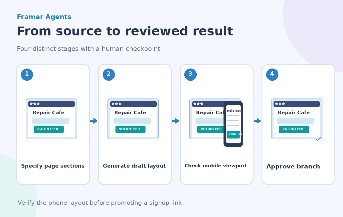
Framer’s current Agents documentation describes an Agent panel that can generate layouts, content, interactions and code on the canvas. It recommends specifying the section structure and, when revising an existing page, selecting the relevant section so the agent can focus its changes. Build the hero first, then the task overview, then the accessibility and signup sections rather than asking for an uncontrolled full-site redesign.
An effective prompt names the target audience, headline, three task cards, one main registration button, and a responsive priority: the button must remain discoverable at narrow widths. Attach approved images and a real logo where licensed instead of accepting generated placeholders that may show equipment the organization does not own. Check the Agent’s result as an editable draft, not as an announcement that a finished event page exists.
Define the CTA as a real destination
Make the primary CTA label unambiguous, such as `Apply to Volunteer`. The destination should be a verified live signup form or a deliberately disabled placeholder until the form exists. A decorative button with no working action is worse than a clearly marked unpublished section. Test that the label matches the action: a form that only requests interest should not say `Your shift is confirmed`.
Keep the button visually distinct from secondary links, and describe what happens after someone submits the form. If approval is manual, tell the visitor that the organizer will review the request. Avoid promises of immediate shifts, certification or equipment access unless the policy supports them.
Check the narrowest useful viewport
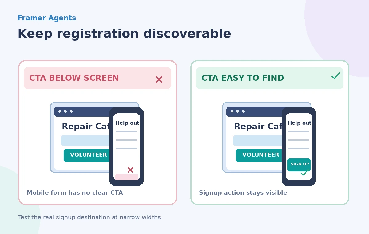
Inspect the actual page at several widths, especially a narrow phone. A two-column desktop layout can collapse into a long stack that pushes signup beneath repeated decorative imagery. Check heading wrapping, button tap targets, navigation expansion, horizontal scrolling, error messages and form labels. The comparison diagram contrasts a hidden or distant CTA with an easy-to-find CTA; it is an illustrative design problem, not an observed Framer defect.
Test with longer accessible text and realistic form validation messages, not only placeholder lorem ipsum. Keyboard focus should reach the button and form in a logical order. A visually correct screenshot does not prove screen-reader support, so audit semantic labels and interaction behavior in the running preview.
Use a branch for risky redesign work
Framer documents branching as a way to explore changes before applying them to the main project and publishing. For an existing public page, make the redesign on a branch so the live signup information stays intact while you assess the new layout. Record which elements changed, including the registration URL, footer contact details and navigation.
A branch is not an approval by itself. Ask an organizer to confirm the event facts and a second reviewer to check responsive behavior. Only then apply the reviewed changes to main and publish. If the form is still not ready, keep the work in draft state, even if the Agent says the layout looks complete.
Review generated content for invented claims
AI can produce plausible but unsupported phrases: “all tools provided,” “fully step-free access,” or “guaranteed placement.” Compare each factual claim with the approved organizer brief and venue information. Delete anything that lacks evidence. For visitor safety, explicitly review directions to entrances and emergency contacts rather than expecting the design tool to infer them from a map illustration.
Where a generated photo or icon is used, check rights and whether it could be mistaken for an actual photograph of the event. Label conceptual visuals when context requires it. A landing page should be welcoming, but not at the cost of presenting hypothetical amenities as existing ones.
Verify links, forms and accessibility end to end
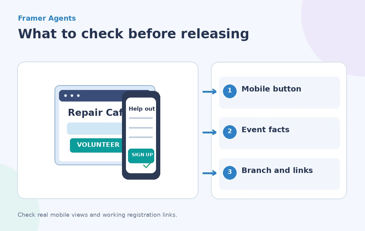
Open the signup destination from the desktop and mobile previews. Submit a non-production test entry if the form owner authorizes it; verify that confirmation language describes only the action that truly occurred. Check required fields, email address formatting, privacy notice visibility and the path back from an error. Make sure a user can abandon the form without losing access to event details.
Review images at mobile pixel density, check color contrast, text scaling and touch targets, and avoid motion that obscures the main call to action. If an agent-added animation causes layout shifts, remove it. Maintain a concise regression checklist so future Agent edits do not silently break the reviewed signup flow.
Release a version that humans have checked
Before publishing, compare the branch against the main page, confirm the contact person and schedule, and capture an approved preview for the volunteer coordinator. Record the published revision and a rollback approach. The agent generates editable material, but the organization owns the facts, the form destination and the effect of a public promise.
A successful Framer Agents workflow is not “prompt and publish.” It is brief, generate, inspect, test, approve and release. The mobile registration button is one small element that exposes whether the whole process respected the visitor’s real task.
How We Research
For this November 2026 editorial review, we consulted these named primary references: Framer Help: How to use Agents, Framer Help: Build a website with Agents, Framer Help: AI Agents. We checked the described capability, scope, documented limitations and approval boundaries against the hypothetical use case above. We did not use a live account, upload real client files, conduct a vendor benchmark, or measure recognition or retrieval accuracy. The diagrams are original teaching illustrations, not screenshots or measured product outputs. Confirm current feature access, fees, security terms and interface labels in the official sources before deploying this workflow.
Frequently Asked Questions
Yes. Framer documentation describes selecting a section on the canvas to scope an Agent change.
No. The project owner reviews and publishes the site through Framer.
Framer documents branches for reviewing changes before applying them to main and publishing.
No. Review times, accessibility claims, contact details and signup terms against approved organizer information.
CTA visibility, link behavior, labels, input errors, keyboard access, wrapping and horizontal overflow.