
A generated checkout screen can look convincing while hiding critical user-experience gaps: shipping costs appear too late, errors are invisible or mobile controls are hard to tap. Figma AI First Draft creates editable website and mobile UI exploration from prompts, but the documentation emphasizes familiar design patterns and notes that using a proprietary design system directly is not supported. This guide builds a fictional stationery-store checkout with a practical audit for fields, totals, accessibility and states. It is a design starting point, not a claim that users completed a live checkout.
Start with user tasks instead of visual mood words
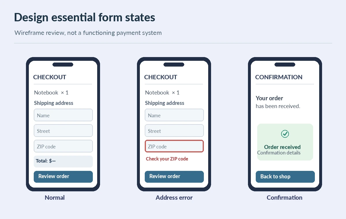
Define a checkout user story: buy one notebook, enter a shipping address, see delivery cost and taxes before payment, review the full total, then confirm. The wireframe needs a cart summary, shipping fields, payment method, primary button, visible validation messages and a confirmation state. Give the first prompt those exact sections instead of “modern minimal checkout.” Identify required states before generating: empty cart, invalid ZIP code, declined payment and success. Mark which parts need verified business rules from the actual store. If a designer invents a tax amount or delivery commitment to fill the mockup, the placeholder must be clearly nonproduction. A wireframe shows information architecture; it does not establish that payment or tax logic is implemented.
Use First Draft as an editable concept, with rollout caveats
The official Figma First Draft guide describes constructing UI from Figma-built wireframing and design libraries. It also says that, from May 20, 2026, the Figma agent is becoming the new entry point, in beta and rolling out gradually. Account plan and editor access affect availability, so check the actual workspace instead of telling every reader to click a single unchanging menu. The historical First Draft flow uses Actions, a web or mobile library, a prompt and Make it; the agent path may differ. Preserve the intent—generate a first pass, then edit and review. The output is a concept made of editable layers, not front-end code, a live payment service or a guarantee of design-system compliance.

Describe the first screen, then require missing states
An example prompt is: “Mobile checkout for a US stationery shop. Show order summary, two address sections, shipping option, accessible required labels, running total and place-order control.” After the first screen, ask for an error version with invalid ZIP code and card failure, then a success confirmation. Don’t rely on the model to remember hidden conditions such as a coupon already applied or a user choosing local pickup. Sketch the full flow beside the screen: cart → details → review → confirmation, with a separate recovery path for failed payment. Every arrow should represent a user action or state change, not just an attractive connector. When the first AI screen is missing a step, add it manually before asking a stakeholder to approve the user journey.
Audit hierarchy and usability on narrow screens
Put the order total near the action, distinguish subtotal, shipping and tax, and ensure the button label describes the transaction. Test a phone-size frame rather than only a desktop canvas. Check label/field associations for later implementation, keyboard focus order, visible error descriptions, tap targets and color contrast. A pretty screen with unlabeled icons or low-contrast totals is not ready for development. Review text enlargement and long address formats, including apartment numbers, against the design. At this point these are design heuristics, not verified accessibility compliance. The implementation will need real keyboard, screen reader and payment-flow testing after developers create the actual interface.
Keep a component reconciliation ledger
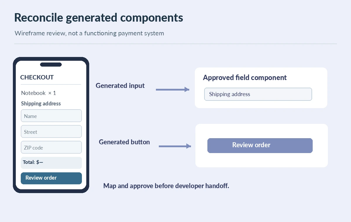
Figma says First Draft uses its own design libraries and cannot currently generate designs directly with your organization’s custom design system. That matters if the store already has button, input, card and spacing tokens. Create a ledger: generated element, approved component, required change, owner and status. Replace generated buttons with real components, normalize text styles and remove redundant icons. Record unsupported elements as manual tasks rather than quietly leaving mismatched elements in the file. The ledger prevents a common handoff problem: development teams believe an AI mockup is already conformant because it resembles the brand colors. A visual similarity pass is not the same as component mapping.
Deliver an annotated handoff instead of an unexplained mockup
Hand off a high-level flow, editable frames for normal/error/success states, the component mapping and a list of unresolved rules. Annotate that shipping and tax figures in the mockup are illustrative until connected to the store. Name each action and describe what should happen when a customer submits incomplete information. Have a developer and a UX reviewer walk the screen sequence independently. Keep the original prompt and revision notes, but do not assert conversion uplift or usability success without a documented user study. The practical result is a coherent prototype brief that exposes missing behavior before engineering time is spent, with a clear boundary between AI exploration and production validation.
How We Research
On October 28, 2026 we reviewed Figma’s official First Draft documentation. It supports the editable wireframe workflow, library foundations, restrictions on using custom design systems and the May 2026 transition to a beta agent. Checkout field recommendations are editorial design QA rather than platform promises. We did not generate screens in a Figma account, run a usability study or test payments.
Frequently Asked Questions
Figma describes generated wireframes and UI designs built from editable components.
Figma describes a transition to an agent entry point beginning May 20, 2026; availability varies by workspace.
The documented First Draft workflow says generating with a custom design system is not currently supported.
No. Payment logic, accessibility, real totals and failure handling still require design and engineering verification.
Flow map, normal/error/success frames, component mapping and unresolved business rules.