
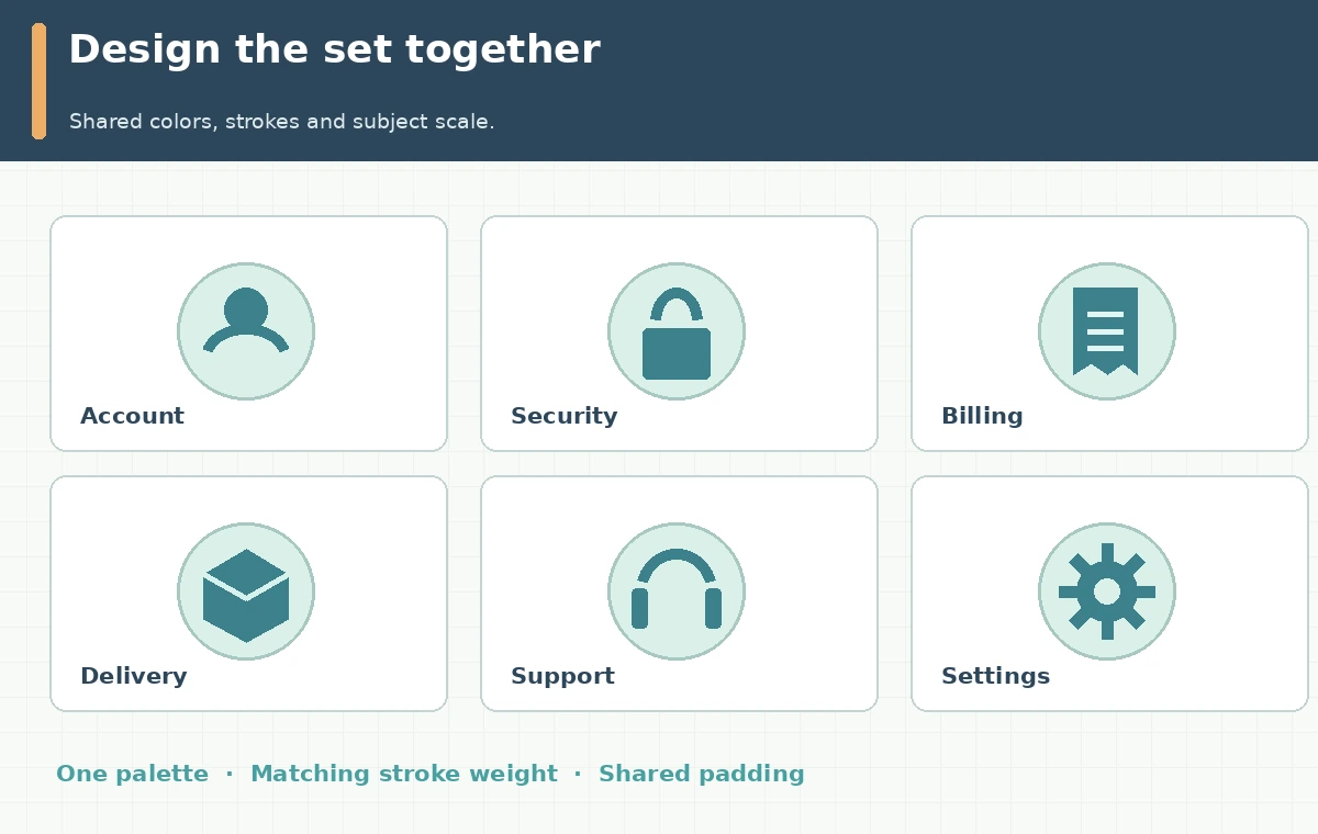
A help center often needs six related illustrations: account, security, billing, delivery, support and settings. Generating each icon as an unrelated prompt invites different line weights, mismatched palettes and inconsistent perspective. Recraft’s Set of Images workflow is designed around generating a cohesive family rather than isolated images. This article uses a fictional support portal and a six-icon storyboard to show how to brief, compare and hand off the set. All visuals are custom concept diagrams, not screenshots of Recraft results or a claim that our prompts were executed.
Start with a defined icon system instead of six clever prompts
Write a short specification: rounded corners, a two-color palette, a common stroke weight, no text inside pictograms, one viewpoint and consistent empty space. Name the six concepts explicitly: user profile, lock, invoice, parcel, headset and gear. Match each to an actual navigation label, because a pretty icon is unhelpful when the meaning is ambiguous. Choose the intended appearance size before generating; a complex image that works at 240 pixels may fail at 24. Keep a master grid with the same artboard and padding for each concept. Do not claim a universal best line weight, since the correct stroke depends on context, display density and accessibility requirements.
Use the Set of Images flow documented by Recraft
Recraft’s official walkthrough describes a Set tool where you can supply up to six image descriptions, choose a style and palette, and set the level of detail before generation. Its 2026 interface changelog lists Set of Images under the Create panel in the refreshed Studio interface. Verify what your actual subscription and current model expose. Enter one concrete prompt per icon, preserving shared attributes in the style controls rather than pasting a different artistic essay into every description. Keep the six meanings fixed through iterations so comparisons reflect visual cohesion rather than scope changes. Do not describe an older screenshot’s placement as guaranteed in the latest interface.
Evaluate the set as a family at full and small size
The primary test is not whether any single symbol looks attractive. Arrange all six on one grid at the final interface size. Inspect stroke width, corner shape, palette, shadow use, object scale and visual complexity. For example, if the gear has heavy thick lines while the headset uses wispy shading, those two icons do not look related. Check silhouette recognition without reading the label. Then put the labels back and ask whether the pictograms support rather than replace the text. An icon-only navigation experience may need accessible names and tooltips; graphic generation does not supply those automatically. Record which members need replacement and why.
Revise the one weak asset without changing the whole family
The Recraft guide describes iterating a selected image and changing styles across the set. In our editorial example, the invoice icon may look like a book rather than a bill. Tighten the prompt to a paper receipt with one folded corner and two horizontal lines, keeping the shared style settings unchanged. Compare the new invoice against the original five icons. If a second generation shifts the palette or line quality, prioritize a consistent family over local novelty. Preserve the accepted version as a reference for future additions. A simple review matrix uses yes/no columns for recognizable subject, matching geometry, palette, legibility and right to use.

Export editable artwork only when it really is editable
Recraft’s materials describe image and vector export options, including SVG in relevant flows, but an exported filename alone is not a guarantee of clean path geometry. Where SVG output is available for the chosen model and feature, open it in a vector editor and inspect groups, strokes and unnecessary nodes. If only a raster output is available, do not label it “fully editable vector.” For interface use, provide PNG or SVG assets according to the product team’s supported pipeline, together with CSS-safe sizing guidance. Avoid confusing raster resolution with vector scalability. A 1,024-pixel PNG can be suitable for a preview but cannot replace a verified scalable icon master in every context.
Check licenses, recognition, and accessibility
Do not include third-party brand marks, a bank’s actual lock icon, or proprietary UI assets unless the usage rights are clear. Keep the approved navigation wording separate from the pictograms. Review color contrast of any functional labels, keyboard and screen-reader behavior of the surrounding controls, and whether meaning survives monochrome or dark mode. A generated headset should not become the only way a user finds contact support. Test meaning with people unfamiliar with the project where possible; we have not conducted such testing here. Make a change log so future icons can conform to the same specification rather than drifting as different designers add new prompts.

Deliver an icon kit that another team can maintain
The useful handoff is a contact sheet, individual assets with clear semantic filenames, the original prompts, palette references, license notes, and a QA checklist. Document the agreed padding, grid size and naming convention; keep production CSS and alt behavior separate from illustration copy. For an icon accompanying a text navigation label, the image may be decorative, while an icon-only control needs an accessible name. Revisit each icon at the actual product viewport rather than approving it only in an oversized artboard. The workflow succeeds when support editors can add one new symbol later without breaking the family’s visual grammar.
How We Research
On October 28, 2026 we reviewed Recraft’s Set of Images instructions and its August 2026 Studio interface update. These support the described set concept, style controls and current Create-panel placement. The six help-center icons, review grid and accessibility guidance are editorial examples; we did not generate samples in the product or benchmark consistency. Recheck the model, plan, rights and export choices before an actual production run.
Frequently Asked Questions
Recraft’s walkthrough says up to six for the described flow; check the current interface for updates.
No. Set generation is designed for coherence, but stroke, color, scale and meaning still require review.
Not necessarily. Verify that your selected output is SVG and inspect its actual paths.
Not safely by default. Clear text and accessible names often remain necessary.
A reviewed icon contact sheet, individual assets, naming rules, style reference and rights information.