
AI slide makers can produce attractive layouts in minutes, but visual polish is not evidence of accessibility. A slide may appear well organized while its reading order is confusing, its icon has no text alternative or its chart uses color as the only key. These defects are easy to miss when reviewers focus only on the generated copy.
This checklist is designed for teams exporting an AI-assisted presentation into PowerPoint, PDF or another presentation format. It combines documented Microsoft accessibility tools with human review. Passing an automated checker is useful, but it cannot guarantee that every audience member can understand the deck.
Start with slide purpose and plain language
Give every slide one unique, meaningful title that tells the audience what to expect. Replace “Results” with a specific, supportable claim or question. Shorten sentences without removing essential qualifiers, and define jargon before introducing it in a diagram. The goal is comprehension, not merely reducing word count.
Review the slide as a standalone page. If the most important point depends on what the presenter says aloud, add enough visible context for someone reading later. Avoid making a visually impressive AI image the only explanation of a process or finding.
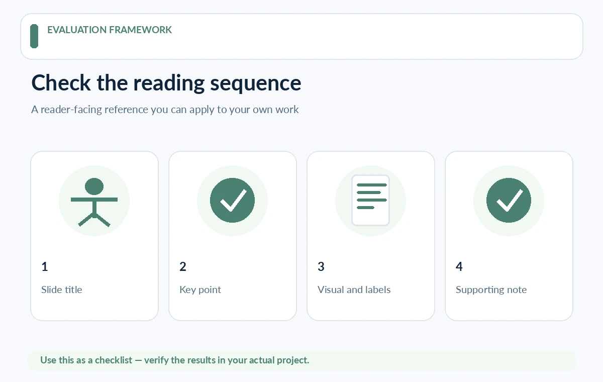
Check reading order, not only visual placement
PowerPoint’s accessibility guidance explains that screen readers can encounter objects in an order different from how people see them on the canvas. Open the Accessibility Checker and Reading Order pane, then verify titles, text, illustrations and chart labels are sequenced logically.
For multi-column layouts, decide whether the narrative should read down one column and then the next. A model may place decorative shapes before content or separate labels from their figures. Move objects or group related elements, and rerun the check after major layout changes.
Write meaningful alt text for informative visuals
Alt text should communicate the purpose of a diagram rather than inventory its colors. For a funnel, explain stages and the conclusion; for a decorative flourish, mark it appropriately decorative if the platform supports that. Do not copy the entire slide title into every image description.
Generated images can contain misleading details. Check the actual displayed image before writing alt text; do not describe objects the picture does not show. If the image carries multiple data points, provide an adjacent text summary or a linked data table rather than squeezing all analysis into the alt field.
Test contrast and avoid color-only meaning
View text against its exact background, including photo overlays and gradient panels. Check small footnotes and chart labels separately, since AI-generated theme palettes may sacrifice readability for atmosphere. A branded color can be used for emphasis without becoming the sole way to recognize a category.
If a chart distinguishes “approved” and “rejected” only by green and red bars, add direct labels or patterns. Test in grayscale and at projection size. Use a consistent font size hierarchy so essential information is not relegated to nearly unreadable decorative captions.
Design charts for interpretation and assistive reading
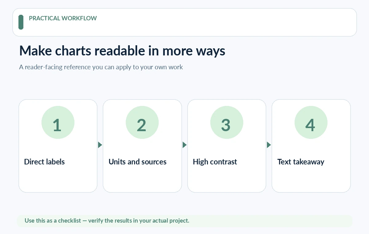
Every chart needs a useful title, visible axes where applicable, readable units, a clear series key and a data source. Explain the main finding in nearby prose. Avoid perspective effects and decorative 3-D elements that make comparisons harder. Check whether data values were invented when the AI generated the visual.
For complex charts, include a simple accessible table or descriptive summary in a handout. A screenshot of a dashboard may contain many tiny labels and no accessible structure. Recreate only the few measures necessary to support the presentation’s message.
Use links, media and animations with restraint
Use descriptive link text such as “Read the evaluation methodology” rather than “click here.” If a video is essential, supply accurate captions or an appropriate transcript. Do not rely on sound or movement to reveal the only copy of a key fact. Ensure automatic transitions do not rush people who read at different speeds.
For a live presentation, tell the audience when a visual changes and describe key imagery aloud. Offer an accessible copy before or after the talk where feasible. Speaker notes are helpful to presenters but may not replace accessible content for everyone who receives an exported PDF.
Inspect exported formats, not just the editor file
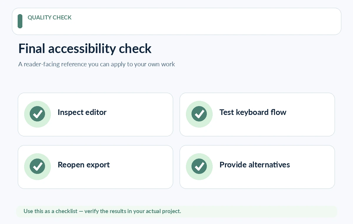
Accessibility properties may change during export. Reopen the PowerPoint or PDF and check reading order, missing fonts, alt descriptions and functional links. Some presentation services can preserve design while converting certain charts to static images; this requires another inspection pass.
Keep an editable source deck as the master and distribute the reviewed output. When a slide is revised, do not assume the previous accessibility check still applies. Run the relevant checks again, especially for newly inserted images or rearranged multi-column layouts.
Run a human-focused acceptance test
Ask a reviewer unfamiliar with the topic to summarize each slide in one sentence using the exported file. Use keyboard navigation where supported and inspect the screen-reader sequence with appropriate tools. Correct missing relationships between labels and figures before considering visual refinements.
Log remaining limitations and provide an alternate format when a complex visual cannot be made understandable within the slide itself. Accessibility is an iterative publishing responsibility, not a certification that an AI generator can grant. Treat feedback from the actual audience as a route to improve the next deck.
How We Research
Research reviewed October 27, 2026. Primary product and accessibility sources: Microsoft PowerPoint accessibility guidance; Microsoft Reading Order pane instructions; Gamma import and editing limitations. We compared only capabilities described in official documentation with the reader task addressed by this article, noted when vendor documentation does not establish measured performance or legal clearance, and structured editorial checks that readers can reproduce with their own materials. We did not purchase plans, run independent benchmarks, verify private accounts, or claim affiliate relationships. Plan terms and interfaces can change; confirm them with the provider before purchase or publishing.
Frequently Asked Questions
No. Attractive layouts can still have missing alt text, confusing object order, low contrast or unreadable data labels. A separate review is required.
No. It identifies many technical issues, but human judgment and accessible alternatives may still be needed to communicate the content.
Usually not. Mark purely decorative elements as decorative where possible and write useful descriptions for images that communicate meaning.
Verify that the title, primary explanation, charts and labels are read in a logical sequence, especially on complex or multi-column slides.
Yes. Export can change links, fonts and object structure. Reopen the delivered file and repeat the relevant checks before distribution.