
A neighborhood library is advertising an autumn reading night. Staff want playful leaf-textured letters for the title, but the date, time and room number must remain unmistakable. Adobe Express Generate text effects can create visual styles from a texture prompt, making the headline more expressive. It should not be trusted to redesign the logistics or replace ordinary readable body text. This guide separates decorative type exploration from the final sign-off on event details, using a fictional poster with an example date and room.
Write the information hierarchy before generating art
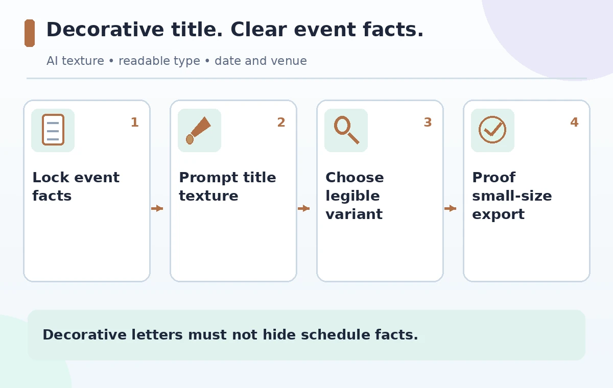
Start in plain text with the event title, verified date, time, physical address, room, accessibility contact and booking instructions. Mark the authority for every factual field, such as the library calendar or the event coordinator. Divide the content into two tiers: decorative headline and utilitarian information. Only the headline should be transformed into a textured graphic; the schedule must remain standard editable type with sufficient contrast. A sample layout might reserve the upper third for ‘Autumn Reading Night’ and put ‘Friday, 6:30 PM — Room B’ in a clean block beneath. This is an example, not a real scheduled library event. Clear hierarchy prevents attractive title effects from displacing the critical information.
Use the documented Generate text effects entry point
Adobe’s current help describes opening Adobe Express, selecting Generative AI, and choosing Generate text effects. Enter a short description of the material or texture, then explore Font, Tint and Style controls before generating a result. More variations can be requested. In this scenario the prompt might be ‘warm autumn leaves and subtle paper grain within bold letterforms; high edge contrast; uncluttered silhouette.’ Keep the exact wording of the headline separately so the output can be compared with the approved title. Access, credits, and available controls may vary by plan and interface; verify them in your account instead of assuming every user has the same generation quota.
Choose textures that support the shapes of letters
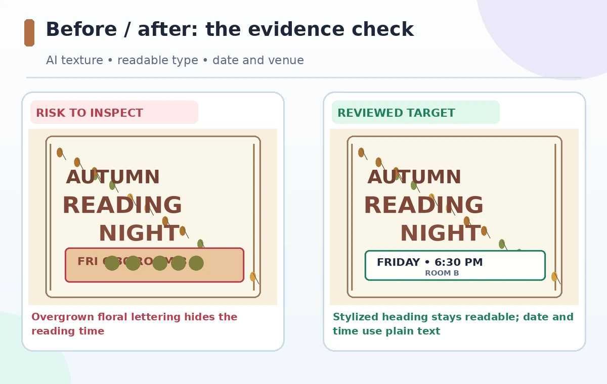
Textured lettering is most effective when recognizable letter contours remain intact. Avoid dense vines that cross an A’s counter, extend through the gap of an R, or make two letters appear joined. Compare at least two variants by shrinking them to the size a visitor might see on a phone. A design can look beautiful at full canvas size yet become a dark mottled stripe on a narrow device. Select an option with a strong outer silhouette, moderate contrast and space between characters. Do not judge solely by stylistic novelty. Readers should be able to identify the event title without needing alt text to decode a visual puzzle.
Protect the date, time and room number
Do not put logistical facts inside decorative text effects merely to make the poster consistent. Keep ‘Room B’ and the date as regular type in a separate layer; a texture generator can make numerals especially ambiguous. In the sample risk frame, a leaf motif crosses the digit in ‘6:30’ and changes its apparent shape. The safer version places the same facts in plain, high-contrast text below the headline. Recheck them against the calendar after every copy edit, since the final design can contain an incorrect time even if the model has generated perfectly formed decorative letters. The diagrams show hypothetical states, not screenshots of Adobe Express output.
Set readability criteria across use cases
A social post viewed on a phone and an A4 printed notice are very different reading environments. Test the composition at 100 percent on the intended device and at a reduced preview size. Confirm that the event title can be read at a glance, the room information has adequate contrast, and the content is not hidden beneath textures or ornamental frames. Test whether the line wrapping breaks words at awkward points. Color alone should not encode essential distinctions such as free admission versus registration required. If the event audience includes readers with low vision, prepare a plain-text caption or accessible HTML event listing in addition to the poster image.
Maintain a verified source for all event copy
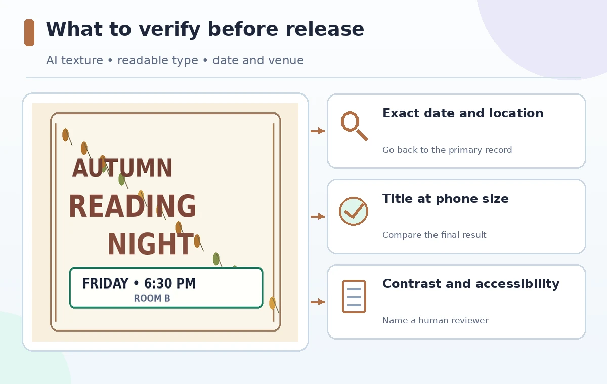
Treat the poster as a rendition of a canonical event record, not as the master schedule. When the library changes a room or a speaker, update the source calendar first; then revise the design. Record which fields were checked and who approved them. If a new text effect variation changes letter spacing or conceals part of a headline, do not leave the old version in a downloadable archive that someone could reuse accidentally. Keep approved exports distinctly named, and identify drafts as drafts in the editorial folder, not on published imagery. The tool can accelerate exploration; it cannot sign off on operational accuracy or accessibility.
Use a restrained alternate design when needed
If all generated textures are visually noisy, create a simpler headline with an ordinary typeface and use autumn leaves as a separate border graphic instead. This fallback still serves the theme while preserving legibility. Do not assume that more regenerations will necessarily yield a usable letterform; generative results vary and can amplify complexity. Another approach is to apply effects only to a short decorative word and keep the remainder of the title in solid type. Keep color balance consistent with the library’s existing identity but do not copy a protected brand design without authorization. Document the source of any externally supplied texture asset and its use permissions.
Export and proof the actual delivery file
Export the intended image or PDF and inspect that file, not just the editing canvas. Check the first and last letter of the title, the exact date, the time zone if relevant, the room number, and any QR code destination in the final output. If a design is posted online, the accompanying text should repeat all essential event details for accessibility and search. Ask a colleague unfamiliar with the draft to say where and when the reading happens using only the poster. If they hesitate, simplify it. The publishing gate is a readable event notice supported by correct source information; a successful generative texture is only one design component.
How We Research
We reviewed Adobe’s Generate text effects guidance and its text editing documentation for entry points, style controls, and standard text layers. The library reading event and visual comparisons are fictional. We did not run a credited generation test or measure accessibility compliance; readable letterforms, source-of-truth checks, and plain-text alternatives are editorial best practices independent of the tool.
Frequently Asked Questions
The documented feature styles text with a prompt. Keep the poster layout and verified scheduling information under separate editorial control.
Adobe documents it under Generative AI in Express, with a prompt and Font, Tint and Style options.
Prefer plain, high-contrast text for dates, times, rooms and registration details.
Try a simpler variant or use regular typography and move the decoration to a separate border.
Read the actual output at phone and print sizes and verify all event facts against the authoritative calendar.