
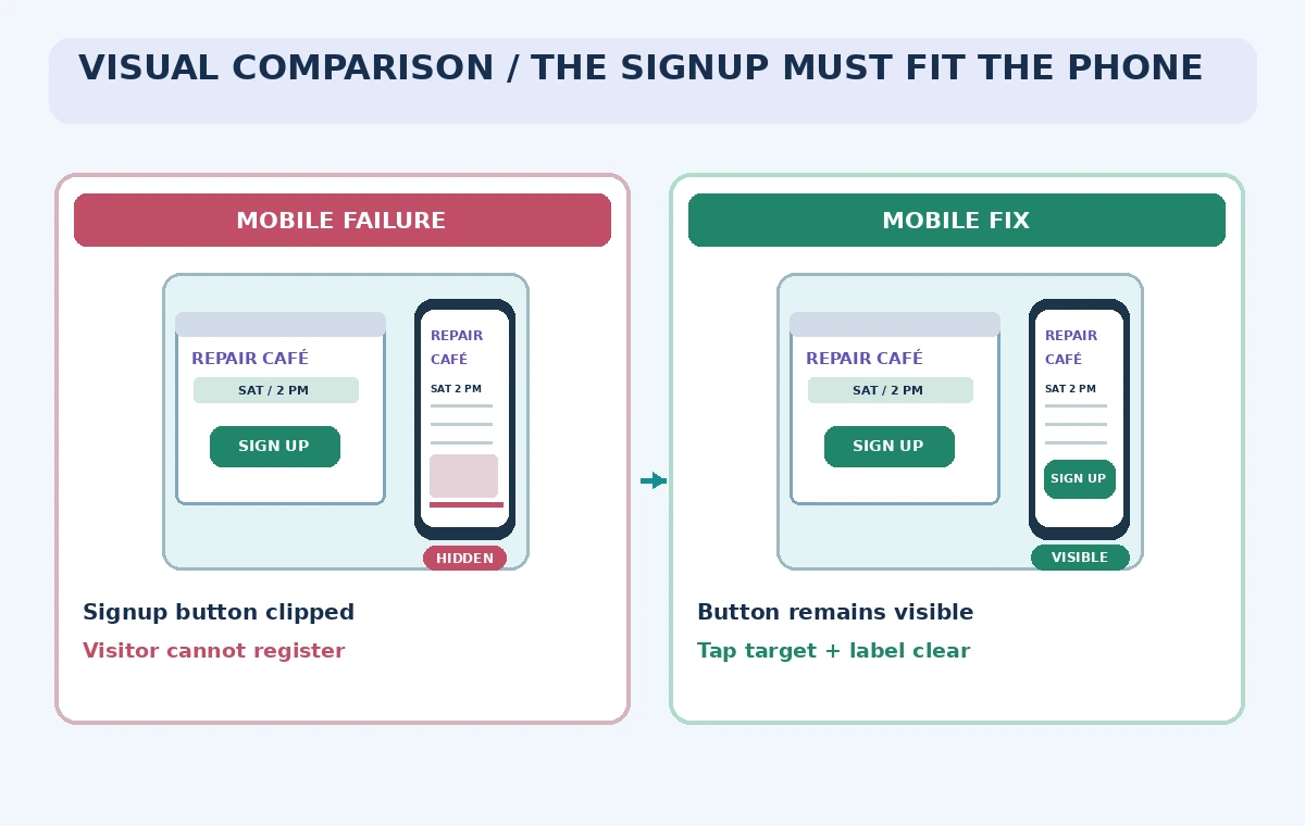
A repair café needs one simple webpage: tell residents what can be brought in, show the correct event time, and offer a volunteer signup link. The designer makes a beautiful desktop layout, but on a narrow phone the signup button falls below a clipped card and cannot be reached. The page may look complete on the canvas while failing the most important visitor task.
Figma Sites supports responsive webpages, breakpoints, previews, and publication from the design environment. This is a web-design workflow, not a claim that an AI generator has automatically checked accessibility. The scenario and layouts here are invented. The goal is a careful authoring and verification process that is distinct from AI-generated code layers or a finished production site.
Start from verified event information and one action
Write the approved event name, date, location, signup destination, and any availability restrictions in a source sheet before designing. A community repair café often has conditional services; an attractive hero section must not promise free repairs, guaranteed diagnosis, or acceptance of every item unless organizers have confirmed those rules. Decide whether the primary action is volunteer signup or attendee information and keep the wording consistent.
Get permission to use logos and photographs. If a form collects contact information, verify the owner, retention notice, and where submissions go. A website design tool does not authorize a data-collection workflow by itself. For this exercise, use a dummy signup destination until the organizer approves the form and any privacy text.
Create the page with responsive structure in mind
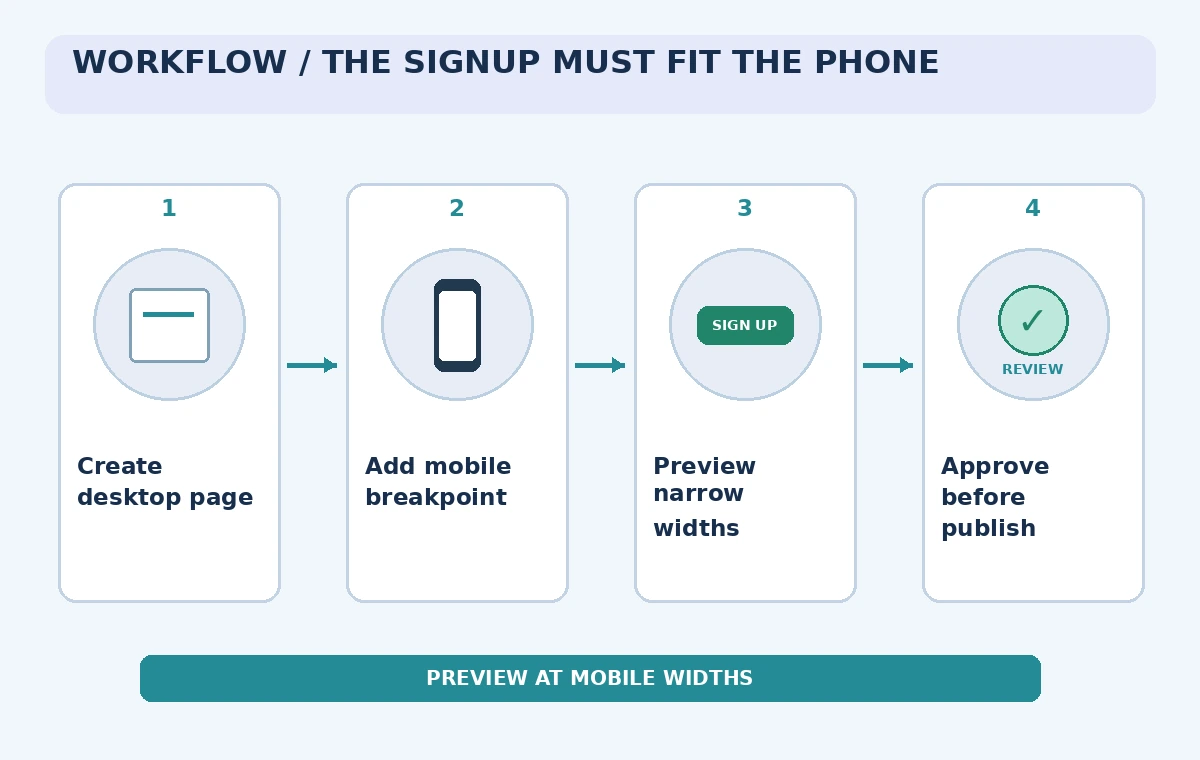
Figma Sites lets users build pages with frames, auto layout, shapes, components, and prebuilt blocks. Begin with a short heading, a legible description, the primary signup control, and a compact schedule card. Keep critical information in normal content order rather than placing it inside decorative background art that might crop unpredictably.
Use an editable component for the signup control and keep its visible label descriptive. Resist adding multiple unrelated calls to action at the top; the visitor should know what the main action does. Organize the source design so event details can be checked against the approved brief and updated without searching through hidden layers.
Add mobile and tablet breakpoints deliberately
Figma documents primary and secondary breakpoints. Changes made to the primary breakpoint cascade to the others, while edits in a secondary breakpoint affect that width. Add the target widths before perfecting desktop-only spacing, then review how content rearranges. Breakpoints are not a promise that a page will work at every size between them.
On mobile, make the action full-width enough to tap comfortably and keep the schedule near the top. A two-column hero may need to become a single vertical sequence. Check that the signup button has not been tucked behind a decorative image, and avoid relying on a hover-only action that touch devices cannot trigger.
Use preview instead of judging the canvas alone
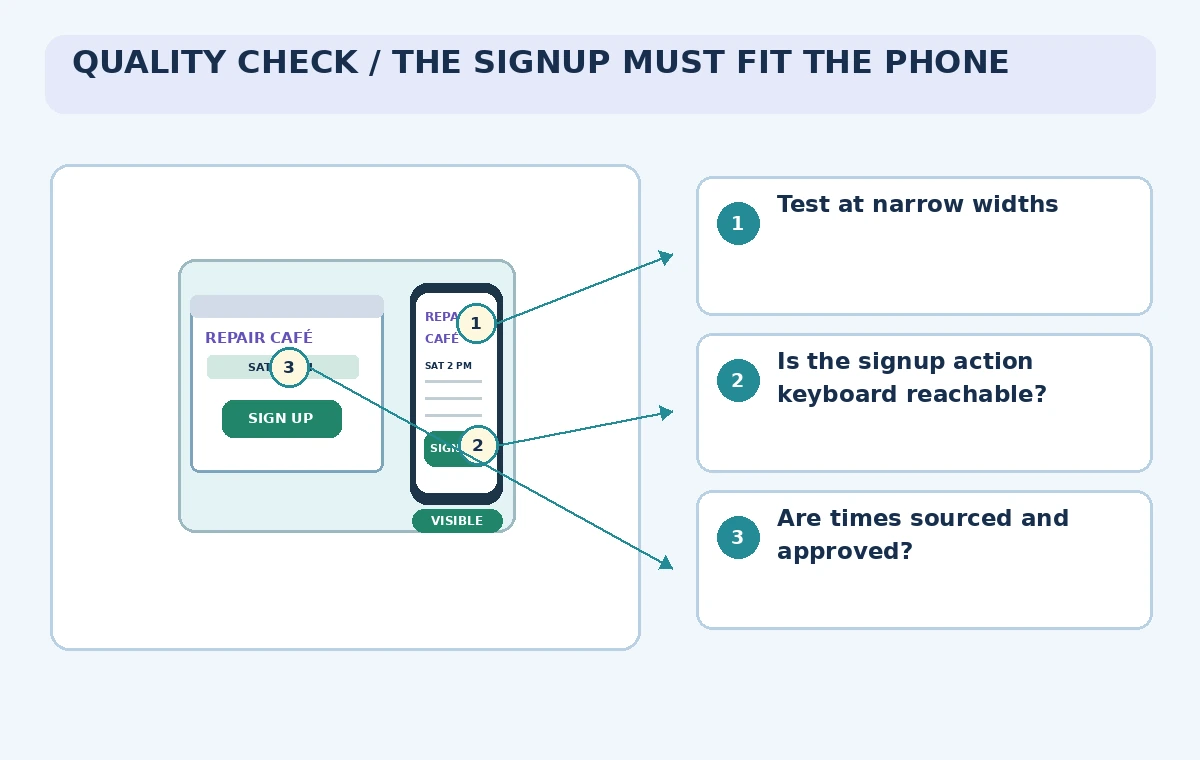
Figma Sites offers inline and full-screen preview, with device-size options and manual resizing. Preview the page at widths smaller and larger than the named breakpoints. Watch how labels wrap and whether the button remains visible and operable. An attractive still frame does not demonstrate that navigation works or that a visitor can complete the signup task.
Click through the target link in a safe test environment. If the destination is a live form, do not submit fictional contact details into the organizer’s database. Verify visible focus states and keyboard navigation as part of a broader accessibility audit; preview is a useful tool but not a substitute for testing with real assistive technology when the site is meant for public use.
Compare a clipped layout with a usable mobile state
The comparison scheme shows the same fictional phone screen in two states: a long card hides the action in one, while the reviewed layout keeps the signup button visible below the event details. This is a conceptual illustration, not a screenshot of Figma or an accessibility certification. Its purpose is to show exactly why breakpoint work matters.
Inspect the readable label as well as the size of the button. An icon-only control may leave visitors unsure whether they are registering, donating, or getting directions. If the event has an accessible entrance, place the correct directions in text rather than hiding them on an image-based map or substituting an invented wheelchair route.
Test interactions, links, and error states
Check that tapping the signup action opens the approved destination and that a back navigation returns cleanly. Examine what happens if the form is full, the page is loaded with a slow connection, or an external link no longer works. Do not imply that Figma Sites itself validates server-side submissions; test those behaviors in the actual connected form or service.
For interactive components, confirm that the triggers and targets are configured correctly. Figma’s preview guidance notes that visual and browser rendering can differ and that some interactions may not behave as expected. Write down any failing width, browser, and action so the designer can reproduce and correct the issue.
Protect the publication boundary
Figma describes a separate publish workflow and warns that webpages on the site canvas may be included when published. Move unfinished or internal pages into a separate file as appropriate. Check title, SEO, access settings, link targets, and the actual event brief before publishing. A preview does not mean a website is private once published to the open web.
Have the organizer approve the final mobile and desktop states. Confirm the registration form owner and that the date, location, and description match the current event plan. Publishing access depends on plan and seat eligibility; avoid assuming every collaborator who can view the file can publish the public page.
Maintain the site after the event changes
If the café changes location or reaches capacity, update the approved facts in every relevant section and recheck mobile widths. A one-line edit can push the button out of view on the narrowest breakpoint. Preserve a simple revision history of the source information and a test note stating which links and widths were checked.
Finally, verify the live page after an authorized publication, not merely the preview. This article does not report a live deployment or compliance audit. The checklist and illustrations are a design-review method for a fictional café; real public sites should be tested against accessibility requirements and actual visitor needs before being treated as complete.
How We Research
For our November 5, 2026 documentation review we consulted the following named official sources: Figma Help: Explore Figma Sites; Figma Help: Add or delete breakpoints; Figma Help: Preview a webpage or site; Figma Help: Publish, update, or unpublish a site. We checked vendor-described product capabilities and known limitations, then mapped them to a fictional use case with explicit human review gates. We did not sign in to a paid account, send real documents or audio, run generated code, publish a live website, generate video through the vendor, or measure results. All images are original explanatory art rather than screenshots or test evidence. Version availability, access conditions, data terms, and legal responsibilities can change; check the latest official docs and your organization’s approved source materials before using this workflow.
Frequently Asked Questions
Yes. Figma documents primary and secondary breakpoints and manual preview resizing.
No. Also check keyboard access, real devices, assistive technology, and relevant standards.
Yes. Review normal content order, clipping, target placement, and intermediate widths.
No. Preview and publish are separate actions described in Figma documentation.
No. The page and all comparison states are fictional instructional examples.