
A neighborhood repair café wants a simple tablet check-in form: attendee name, optional contact details, selected repair category and a way to request assistance. A polished first screen is easy to generate; a useful design also explains what happens when a required field is empty, a keyboard user cannot reach a button or a visitor declines to share contact information. Figma First Draft can accelerate early screen exploration, but it does not certify a usable service. This illustrative workflow focuses on preserving the organization’s actual intake policy and showing the error paths that a quick AI mockup tends to leave invisible.
Write the real check-in rules before prompting
List each field with its purpose, whether it is required, who sees it and how long the record will be retained. For this fictional event, a name or visitor identifier and a service category may be required, while a phone number should remain optional. Do not invent a consent checkbox merely to make the screen look compliant. Include the exact help contact, an accessible alternative for someone unable to use the tablet, and a clear statement that check-in does not guarantee a repair. Ask the organizer to approve the language before generating any UI. Keep a separate requirements sheet because AI-produced placeholder copy can look definitive even when nobody has authorized it.
Generate an editable wireframe, not an approved product
Figma describes First Draft as a way to turn a prompt into editable website or mobile designs using common pattern libraries. In Figma Design, eligible editors may find it through Actions, First Draft and Make it. Figma also announced that, beginning May 20, 2026, its agent becomes the new entry point during a gradual rollout, so the visible control may differ by account. Ask for a tablet-sized check-in flow with a welcome screen, form, review step and completion screen. Explicitly request a separate error screen and a way back to correct entries. If the agent route appears instead, use the same brief and inspect the resulting editable layers.
Inspect the generated information architecture
Trace the entire route from the arrival screen to completion on paper before adjusting colors. A visitor should be able to understand what the service is for, choose a category and see whether their check-in was accepted. Watch for plausible but unapproved extras such as a payment step, compulsory mailing-list signup or fake availability estimates. Remove them rather than rationalizing them as useful defaults. Mark each screen with its human-confirmed business purpose. A generated screen is an invitation to review layout ideas, not proof that a database, authentication step or service reservation actually exists. Keep a state map alongside the frame list.
Show the invalid state alongside the normal state
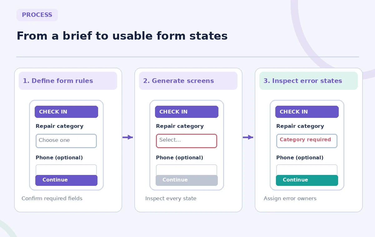
Make the empty required-field error visible within the prototype: a clear text message should explain the missing category next to the control and appear in the reading flow. A red border on its own is not sufficient. Compare a tempting broken design that merely disables Continue with one that says “Choose a repair category to continue.” Show what happens after correction: previous entries should remain where possible. The side-by-side schematic is an invented illustration, not a screenshot or test of Figma’s AI output. Do not fill the example with identifiable visitor data. Verify that the message says what the actual form will validate once implemented.

Turn visual elements into accessible interactions
Check the tab sequence, visible focus treatment, label-to-field association, heading order and target size. A mockup may look accessible while containing no keyboard behavior at all, so distinguish annotated design intent from functionality proved by a prototype. Do not describe a decorative focus outline as an implemented focus state. Create a separate interaction checklist for the engineer and test with keyboard-only navigation after a working version exists. The return-to-form action should be clearly named, not represented by an unlabeled icon. Verify that text remains legible at mobile zoom and that helper text is not hidden behind the tablet keyboard.
Protect optional information from becoming mandatory
A contact field may be offered so the organizer can follow up, but declining it must not secretly block check-in if the approved policy says it is optional. Prototype both routes explicitly. Replace generic “We value your privacy” filler with approved concise information about what is collected and why. Avoid using real visitor details in prompts, mock data or images. If the organization uses a separate booking system, make the separation visible instead of implying that the generated interface books appointments. Review whether a guest can request a printed or assisted route without being steered into unnecessary data collection. Assign one person to sign off on each privacy-related sentence.
Review edge cases with event staff and a developer
Test a first-time visitor who has no phone, an attendee choosing an unclear repair category and someone who presses Back after receiving an error. Ask the front-desk volunteer whether each path matches what actually happens at the repair café. Ask a developer which validation rules can be implemented and how error messages will be announced to assistive technology. Record differences between a proposed design and a confirmed operational requirement. Do not present these walkthroughs as usability-test statistics. The inspection diagram calls out a missing label, an inaccessible continuation path and a misrepresented optional contact field to keep reviewers focused on concrete defects.

Hand off a versioned concept with known gaps
Export or share a versioned Figma file containing the screen sequence, error-state examples, approved copy and an unresolved-question list. Label the work as an early design concept and link to the requirements sheet, not to nonexistent production endpoints. Keep implementation notes for input validation, submission handling and accessibility acceptance tests separate from marketing visuals. If generated layouts are revised, check every state again; style changes can obscure the very messages the review added. Figma’s tool provides quick editable exploration, but real form quality is established through human decisions, engineering and testing with users.
How We Research
We checked Figma’s official First Draft documentation for generation steps, editable outputs, plan requirements and the May 2026 transition to the Figma agent. The form and error screens are invented educational examples. We did not run First Draft in a paid workspace or conduct user testing; interaction advice is editorial review guidance rather than a claim about automatic Figma validation.
Frequently Asked Questions
Figma announced the agent as a new entry point beginning May 20, 2026, during gradual rollout; check the controls actually shown in your workspace.
Treat generated screens as design concepts. Document and implement validation behavior separately, then test it in the working product.
Figma says First Draft uses its own component libraries and cannot currently generate directly from a custom design system.
Only if the organization has an approved reason. This hypothetical flow intentionally makes contact details optional.
Provide the approved requirements, annotated error paths, accessibility criteria and questions that still need an accountable owner.