
A generated landscape may be beautiful yet unusable as a campaign background or story illustration: the horizon tilts, shadows contradict the sun, or the visual center is crowded with mountains. A dedicated landscape workflow is about spatial design and editing decisions rather than ranking every image generator. This guide uses Adobe Firefly’s documented composition and style references as optional controls and an imaginary coastal valley brief for concrete examples. No real location, geography, or generated result is claimed.
Define the destination and the environmental story
Write the purpose before writing the prompt. A wide editorial banner needs a clear area for a headline, whereas a fantasy game scene needs a navigable path and separation between near and distant terrain. Record aspect ratio, target crop, season, time of day, viewpoint height, and one focal object. For a hypothetical coastal valley, choose “sunrise, footpath toward a distant lighthouse, low mist over water, clear space in upper-left sky.” Treat each item as a design constraint you can inspect, not poetic filler. Avoid mixing contradictory conditions such as midday sun, deep nighttime stars, and evening-colored shadows unless the scene deliberately portrays surrealism. If the image represents a real destination, generated scenery is not evidence of its actual geography, hazards, or accessibility.
Sketch a three-depth plan before generating variants
Use three layers: foreground, middle ground, and background. Foreground rocks or grasses provide scale; a midground path and water establish route and relationships; distant ridges and sky hold the horizon. Draw a simple value thumbnail using light and dark blocks before using AI. The most important question is whether the eye can travel from the entrance to the focal subject without getting trapped in competing bright patches. Place the focal object at a deliberate location, then reserve negative space for any later typography. Atmospheric perspective normally reduces contrast and detail as elements recede; use that as an editorial review cue rather than expecting the model to apply a correct physical simulation. Separating depth layers also helps communicate feedback to a human designer.

Use composition references to constrain shape, not geography
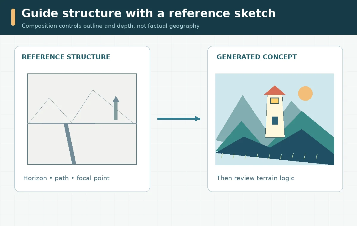
Adobe describes Firefly’s Composition reference as using an uploaded image to guide outline and depth, with a Strength control for how closely the generated variation follows it. A rough grayscale sketch of the valley path and mountain masses can serve as a better spatial guide than a second fully rendered picture. Keep ownership or permission records for uploaded references. A composition reference is not a guarantee that buildings remain dimensionally accurate or that terrain agrees with an engineering survey. For an architectural visualization or travel information page, replace uncertain details with verified photography or plans. Create one clear reference that shows the horizon, path, lighthouse, and empty sky; then evaluate whether each generation follows those relationships.
Separate color style from the structural brief
Adobe’s Style reference is a different control: it can steer the look and feel of imagery, including the palette and textural treatment. If the brief calls for a painterly sunrise, use a permissible palette reference without changing the path geometry. Compare a warm and a cool direction separately instead of changing both the image structure and the visual style in one uncontrolled pass. Firefly’s documented options vary by chosen model; do not assume a particular reference control exists for every partner model. Keep descriptive prompts explicit: “muted coral sunlight from right, cool blue shadows to left, light fog only above the water.” Review for an internally consistent light direction. Artistic color is flexible, but a shadow pointing toward its own light source is distracting.
Test weather and atmosphere without losing usability
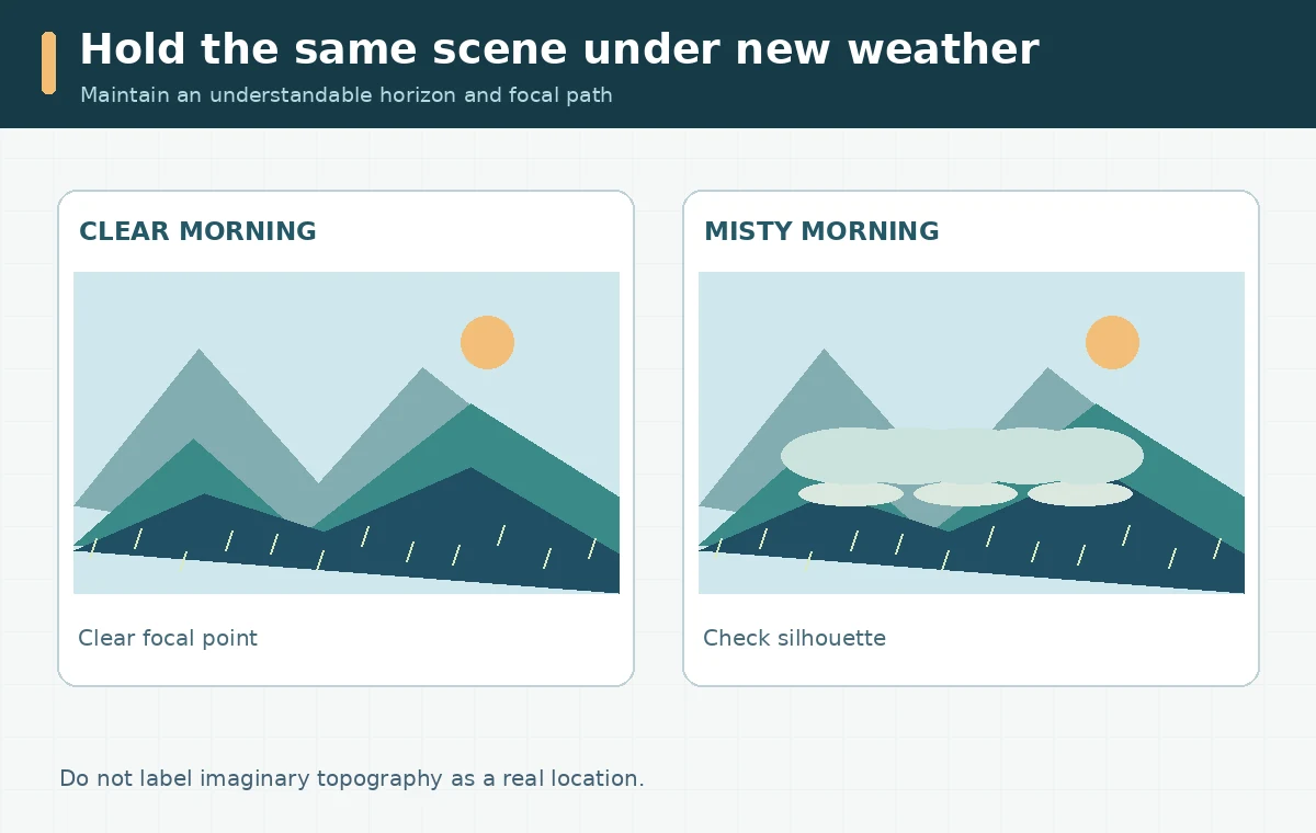
Weather should reinforce the visual hierarchy, not erase it. Low fog can separate the middle ground from distant hills, while a heavy storm may hide the lighthouse that defines the scene. Prepare two purposeful variants: a clear-day option for navigation and a mist option for mood. Compare both against the same thumbnail and crop. Inspect the transition where cliffs meet water, cloud shapes that repeat unnaturally, and reflections that disagree with the shoreline. For readers or players who must locate objects in a scene, enough local contrast is more important than dramatic particle effects. Avoid attaching invented weather readings, real disaster imagery, or an exact location label to imaginary terrain. State clearly when the picture is conceptual.
Review scale, continuity, and mobile cropping
Use a small checklist at three views: full-size detail, article-width display, and phone-sized crop. The full-size review catches impossible trees, duplicated peaks, and broken shorelines. Article size reveals whether the main path and lighthouse are understandable. The phone crop catches a title colliding with the mountains or a focal subject disappearing outside the safe area. Check that water level, horizon, and far ridge heights form a coherent visual system. If the scene is part of a set, compare the color key and time-of-day notes across all images; a series should not jump from pastel morning to saturated midnight without a narrative reason. Keep final captions as text overlays rather than relying on model-generated lettering.
Package a scene specification that another editor can reuse
The useful deliverable is a scene brief containing the target dimensions, a three-layer sketch, lighting notes, selected reference license, final selected render, and a short rejection log. Explain why one variant was chosen: “path remains visible at thumbnail size and empty sky supports headline,” not “this generator achieved 95% realism.” An illustrator can then repaint terrain edges, add precise signage, and adapt the layout for multiple crops. If a real map, tourist guide, or safety-critical scene is required, do not substitute this artwork for ground-truth information. The approach works because it separates structure, style, and factual verification into distinct decisions, reducing repeated random prompting while keeping the creative outcome editable.
How We Research
We consulted Adobe’s composition-reference documentation, style-reference guidance, and aspect-ratio instructions on October 28, 2026. The valley is a fictional explanatory brief, not a landscape we generated or a verified place. We distinguish documented product behavior from illustrative editorial workflows and do not assert personally tested output quality or a feature outside the cited product documentation.
Frequently Asked Questions
Define the target aspect ratio, viewpoint, horizon, focal object, lighting, and a clear use case before adding stylistic adjectives.
No. Composition primarily guides spatial structure and depth, while a style reference guides visual appearance such as color and texture.
Not as evidence of an actual place. Generated topography and landmarks may be fictional, so use checked sources for factual travel imagery.
Reduced distant contrast can make the foreground and focal path easier to read and supports a believable sense of depth.
Preview it at the intended phone crop, ensure the focal subject remains visible, and keep text outside busy sky or terrain boundaries.