
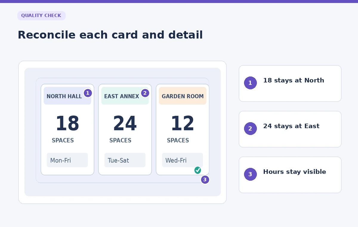
A neighborhood group needs a one-page fictional resource briefing showing where visitors can find three community support desks. The design should fit on a phone and be readable in a meeting, but the numbers are more important than decoration. North Hall can serve 18 people, East Annex 24, and Garden Room 12 in the example dataset; those are invented teaching values, not live operating capacities. Gamma 5 offers responsive grids and layout ideas, yet rearranging cards can make a capacity appear beside the wrong site. This guide keeps data ownership separate from layout experimentation.
Build a source-of-truth table before designing
Start outside the deck with a simple approved table containing the location name, capacity, opening hours, accessibility contact, and update date. Use distinct fictional names so reviewers can identify a misplaced value quickly. Label the source document “training example” if it is not an operational briefing. Do not enter guessed phone numbers or addresses merely to make a card look finished. Each number in the deck must trace to a row in the table, including the total if one is shown.
Assign each location a stable identifier such as N, E, or G and use it consistently during layout review. The identity field should travel with the data rather than relying only on card position or color. This matters because a two-column view may become a single column on mobile, and sorting can accidentally change which caption sits next to which count. Decide whether location order communicates priority, travel sequence, or no hierarchy at all.
Understand Gamma 5 grids and legacy layouts
Gamma’s current help documentation describes grids as a unified layout system in Gamma 5, replacing the separate columns, card layouts, and smart layouts of older presentations. Classic documents may still show older arrangement tools. In a current document, use a grid preset that supports three cards or a vertical sequence. If an older menu name appears in a tutorial, do not assume your screen must match it exactly. Version-dependent interface differences are not an error in your content.
Choose fixed or fluid layout behavior with the actual publishing target in mind. A fluid page can expand, while a fixed 16:9 presentation may reduce content to fit. Neither behavior guarantees legibility. Place the longest location name and the complete opening-hours string in the design first. Short placeholder words often conceal the line-wrap problems that appear after real data is pasted into the final briefing.

Try AI layout suggestions without changing facts
Gamma’s layout help describes an AI option to try a new layout and preview alternatives for existing content. Use it for visual arrangement, not for researching or approving facility details. Save a version before requesting a new layout. Compare the resulting headings, counts, and labels line by line against the source-of-truth table. If the layout suggestion moves a number into a neighboring card, undo or manually correct that card before making any further changes.
Treat the three location cards as separate linked units: title, capacity, hours, and contact guidance. If a suggestion creates decorative comparison bars, ask whether readers might interpret them as a measured ranking. In this fictional example, North Hall’s 18 and East Annex’s 24 are capacities, not quality scores. Remove graphics that imply superiority without evidence. An AI layout can help establish hierarchy, but it cannot decide which numeric claim is approved.
Keep card reading order consistent on mobile
Preview at desktop and phone widths. When the grid collapses into a column, verify that North Hall still appears with 18, East Annex with 24, and Garden Room with 12. Check what a screen reader or keyboard user would encounter if the format is published as an interactive page. A visually tidy layout may still interleave captions and figures in an order that is confusing when read linearly. Keep each card’s data adjacent in both visual and logical order.
If the briefing includes a route sequence, number the stops independently of the card grid. Do not use “left card” or “top-right box” in instructions because those descriptions change with screen size. Replace position-dependent references with stable location names. For a downloadable slide or PDF, inspect the exported file itself rather than assuming that the editor preview exactly matches final typography and line breaks.
Handle overlong notes without hiding exceptions
The example East Annex has a fictional note that the front desk closes earlier than the building. That exception must remain visible even if it makes one card taller than the others. Do not delete the qualification to achieve perfect symmetry. Use a smaller secondary line, an expandable note with a clear label, or an additional slide when the constraints demand it. Users need the exception much more than they need equally sized cards.
Avoid squeezing all details into one tiny grid if the deck is intended for projection in a busy room. Separate the immediate decision facts from detailed contact instructions, then keep a way to reach the details. Test the card with the longest note first. If a suggested layout scales its body text below a readable size, reject that alternative, simplify decorative elements, and preserve the complete information.

Compare the new design with a reconciliation ledger
Create a ledger with one row per location and one column per fact. For each card, mark capacity correct, hours correct, site name correct, and caveat present. In a three-card deck there may be only a dozen facts to audit, making this a quick and reliable manual task. Check for duplicate counts, reversed labels, or a total that no longer matches the individual entries. Design software cannot replace this reconciliation step.
Have a second reviewer locate East Annex without hints and state its capacity and any access caveat. Ask them to repeat the task on a phone. This is a practical review of a sample document, not a claim of tested conversion rates or accessibility certification. If they name North Hall’s capacity instead, improve the card grouping and hierarchy rather than simply changing its color. The artifact must work when a reader moves quickly.
Plan a responsible AI workflow
Export carefully and document the version
Choose the export mode required by the publisher, such as a web presentation, PDF, or PowerPoint. Inspect the exported output, especially fixed slides where text can shrink, and verify that location cards remain intact. Include a clear “sample data” label for this hypothetical exercise. For a real community resource sheet, substitute verified current information from the organization responsible for operating each location before distribution.
Preserve the source table, the Gamma draft, a snapshot of the approved version, and the person responsible for factual approval. Keep layout experiments separate from the authoritative schedule. A minor update to one facility’s hours should trigger a fresh check of the displayed card and any summary totals. The workflow succeeds when the visual redesign helps people find information faster without silently changing a single capacity, label, or exception.
Know when a simpler layout is better
A grid is not automatically superior to a vertical list. If every card includes multiple paragraphs of accessibility guidance, the design may be easier to read as a document with clear headings. Likewise, a map can be useful only when the locations and directions have been independently verified. Do not introduce a location pin merely to make the slide look polished. The most effective arrangement follows the real decisions readers need to make.
Use AI suggestions to explore, then select the least ambiguous version. Recheck every detail after each substantive layout change. If an export loses small footnotes, restore a simpler layout or split the page instead of hiding information. The final standard is a reader’s ability to identify the right place and its constraints, not the novelty of the chosen visual template.
How We Research
We consulted official Gamma 5 AI Layouts documentation 1 and official Gamma 5 AI Layouts documentation 2 to verify the feature names, access constraints, and described controls. We built the scenario as a fictional editorial example and separated the product documentation from the independent review steps recommended here. No live customer account, recording, operational dataset, or product output was tested; all numbers, people, places, and illustrated screens are teaching examples. Access and interface details can change, so readers should verify current plan eligibility and instructions in their own product before following the workflow.
Frequently Asked Questions
Not exactly. Gamma explains that Gamma 5 uses grids as its unified layout model, while older or classic documents can retain legacy columns and smart layouts.
A layout suggestion should not be treated as a verified operational source. Reconcile every figure and condition against the responsible organization or your approved source table.
Responsive layouts may reflow as the available width changes. Test the narrow layout and use stable location labels rather than instructions based on visual position.
No. A qualification can change whether a visitor can use a location. Give it readable space, even if that means a taller card or an additional slide.
Open the actual exported file and inspect card boundaries, font sizes, reading order, capacity figures, hours, and any sample-data label or important exception.