
A hypothetical craft archive needs a consistent online catalog for five photographs of a handwoven scarf. One image was photographed by a window, another under warm display lighting, and a third against a neutral paper sweep. A reference photo offers a polished visual direction. Yet the scarf has a narrow indigo stripe beside an ocher stripe; changing their relationship would misrepresent the textile rather than merely unify a series.
Capture One describes Match Look as a way to apply a reference image’s look to another photograph with a click, providing a starting point for color grading. That is different from reproducing the physically measured color of dye. This article presents a controlled editorial method, not a test of Capture One output or proof of any specific textile color.
Record the scarf’s visual facts before matching a look
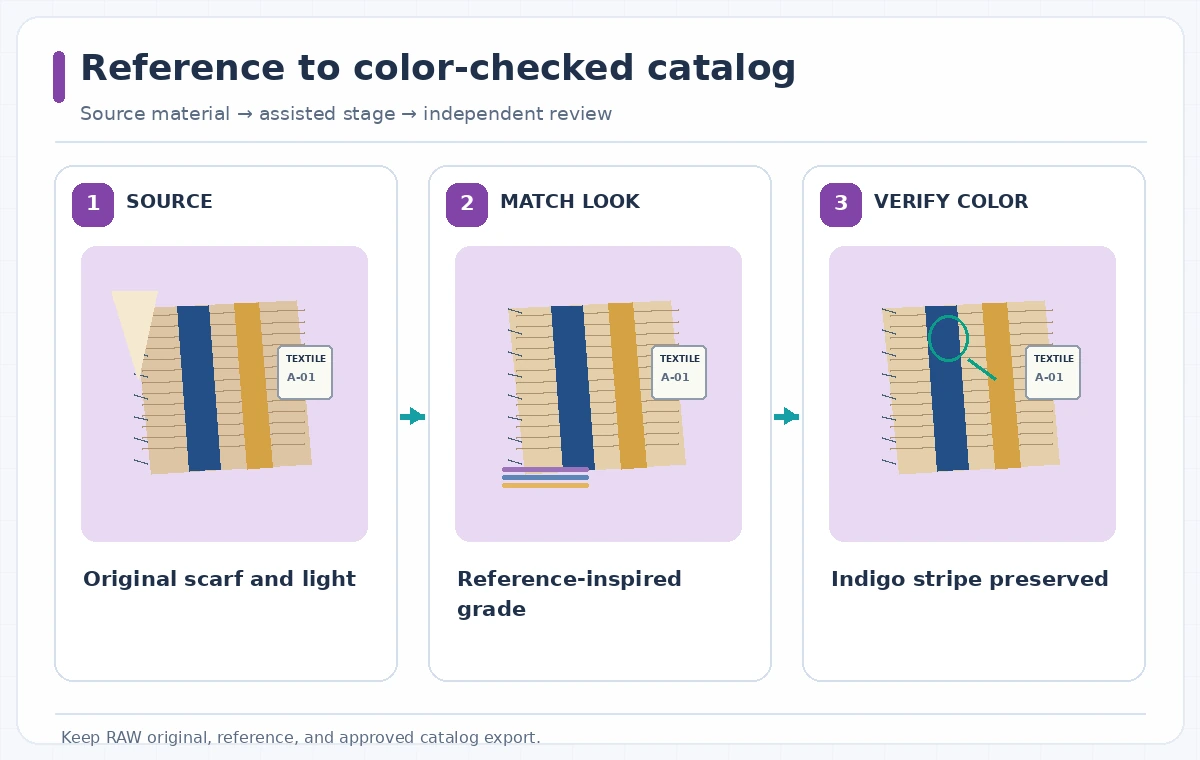
Begin with an untouched RAW file or highest-quality source and a written collection record. Photograph a color reference under known lighting if the archive has a standard, and note the scarf’s stripe count, sequence, material and agreed descriptive terminology. The example indigo and ocher stripes are fictional; no reader should interpret the diagram as a measured textile. Make a duplicate edit variant before changing color so the original survives every grading experiment.
Divide the requirements into two columns: permissible presentation changes such as balancing background warmth, and protected facts such as stripe hue, thread pattern and the edge of the woven label. A curator or product owner should authorize those protected details. Without that separation, a reference photo selected for its beautiful cinematic tone can become an unintentional color specification.
Select a suitable reference instead of a fashionable preset
Choose a reference photograph whose light direction, subject scale and color intent are relevant to the actual catalog. A richly amber lifestyle picture may work as inspiration for marketing, but a neutral studio textile image is often safer for documentary presentation. Capture One says Match Look can draw on a previous project, film still or mood board; the editor still chooses whether the reference is appropriate.
Avoid references containing dramatic colored gels or extreme local contrast when the goal is to display fiber and weave. Compare skin tones or scenery only if they really appear in the product scene. Store the reference, its ownership information and a brief note explaining why it was selected. The useful outcome is a repeatable comparison, not an untraceable favorite filter.
Apply Match Look as a proposal, then inspect the controls
Open the scarf photo in a supported Capture One installation and use the current Match Look interface to bring in the chosen reference. The company describes an assisted one-click style transfer; exact control placement and eligibility can change by software version or license. Apply the result to a separate variant or layer-aware workflow rather than replacing the original file. Check the official release notes before relying on specific hardware acceleration.
After the suggested grade, examine shadows, highlights, white balance and saturation at more than one zoom level. An attractive image can still crush the navy thread into black or turn ocher into fluorescent orange. Where normal color tools offer better control, refine the result manually. A single automatic application is only the beginning of the edit, not evidence of faithful reproduction.
Compare the protected stripes with the original
Place the source and candidate grade side by side on a calibrated display when one is available. Our illustrated comparison shows a plausible failure—an indigo stripe shifted toward violet—and a desired state that retains the original stripe identity while making the background more consistent. These are conceptual drawings, not actual outputs or objective color measurements from Capture One.
Move beyond a pleasing thumbnail. Zoom to the interwoven fibers, ensure the stripe boundaries have not been swallowed by contrast, and check the label and small stitch marks. Sample values can help identify drift but cannot by themselves replace a reference captured under controlled lighting. Ask the catalog owner whether the graded preview still describes the physical object accurately.

Make consistent catalog images without erasing lighting evidence
For the remaining photographs, compare every candidate against both the selected reference and the original of that particular angle. A single grade may treat backlit fibers differently than front-lit ones. If a change only works on the clean studio shot, do not force identical settings onto a window photograph. Consistency means recognizable subject color across the set, not identical pixels in every context.
Keep any aesthetic interpretation separate from record photography. If the archive also wants a cinematic promotional banner, label it as styled art and retain a neutral catalog image. Avoid describing a processed image as the unmodified historical record. For accessibility, give alt text describing the real visible scarf and its stripe sequence rather than claiming a specific dye chemistry from appearance alone.
Document who can approve color and which files they saw
Arrange review with a textile specialist or the owner of the physical item. Show a full-resolution source, the matched version, and the reference side by side. Ask the reviewer to check the stripe identity and count, visible weave structure, label legibility and background neutrality. A marketing reviewer may approve composition while lacking authority to certify archival color; assign those roles explicitly.
Export a preview at the final website size and recheck on another display when possible. Compression and browser color management can alter perceived color even when the edit is reasonable. Archive versioned files, chosen reference, reviewer comments and export settings. If the archival standard is unclear, keep the neutral source available and avoid assertions about exact reproduction.
Use a release checklist rather than a one-click success claim
The final gate asks whether the current file shows the correct indigo stripe, the neighboring ocher stripe, the woven label and the weave texture without misleading shifts. Check that the appropriate image is attached to the correct catalog record and that the reference photo has the necessary reuse permission. These verifications are about the object and the asset chain, not about the popularity of the reference look.
Reject an image if a stripe has moved toward an unsupported color, texture looks painted, or two angles disagree about the same feature. Return to a conservative grade or an unstyled source as needed. The strength of Match Look is speed in proposing a consistent aesthetic; the archive’s accuracy comes from a separately documented human review.

How We Research
We reviewed the named official product guidance on November 4, 2026: Capture One — Assisted editing and Match Look; Capture One — What’s New; Capture One — Release notes. We compared documented entry points and availability limits with the needs of a hypothetical editorial task, then planned human checks around indigo stripe and catalog color reference. We did not log into an account, process actual source media, measure model accuracy, confirm historical records, or test pricing. Illustrations intentionally contrast possible errors with editorial targets, not measured software output. Recheck the vendor’s current instructions, account entitlement, permissions and source facts before publishing a real project.
Frequently Asked Questions
No. Capture One describes visual style transfer from a reference image, not scientific measurement of a fabric’s true dye values.
Yes as an editorial starting point, but inspect each image independently because lighting and exposure can vary.
No. Retain the untouched source and work with versions or duplicates so changes are reversible.
A strong reference palette or contrast adjustment may shift perceived hue. Compare against the source and an authorized physical reference.
No. The scarf and the diagram are instructional examples; actual results need to be tested on the user’s own files.