
A food-pantry volunteer wants a consistent layout for a donation-day poster: a large produce illustration on the right, clear copy space on the left, and room for a verified drop-off address. Adobe Firefly’s Composition reference feature can guide where elements sit in an image; it cannot ensure original artwork, accurate text, or permission to reuse a reference photo. This illustrative workflow uses a volunteer-owned sketch to steer the layout and leaves every operational detail in editable, human-checked type.
Start with an owned layout sketch
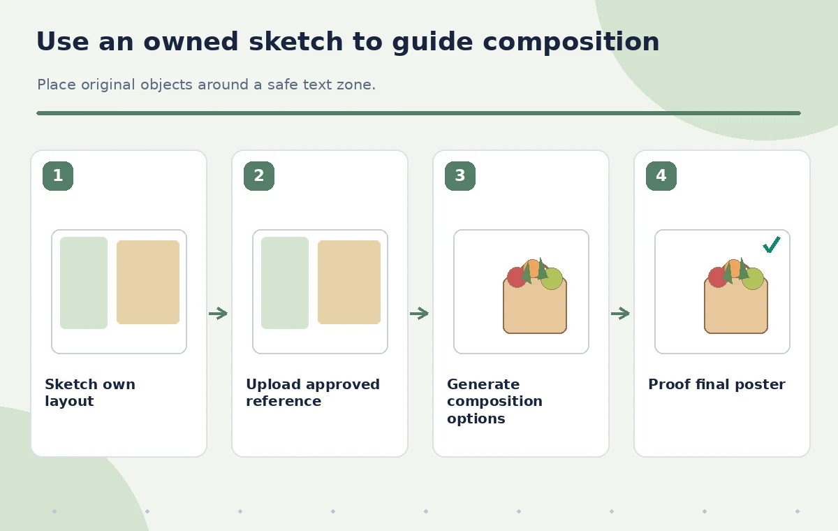
Create a simple sketch containing a headline zone, a focal object zone, and a footer where drop-off details will eventually sit. Use blocks, arrows, and relative sizes rather than tracing someone else’s advertisement. The easiest rights question is the one avoided by using a layout designed within the organization. Record who created the reference and whether the image may be uploaded to a generative service.
The pantry’s example reference includes a rectangular text area occupying the left half and an open illustration area on the right. It does not include a logo, product package, or photographer’s distinct work. Keep the event’s approved address, date, hours, and sponsor marks in a separate fact sheet. These are not creative elements the image generator should be trusted to invent or reproduce.
Understand what the Composition setting influences
Adobe describes the reference as guidance for the structure of an image: outline, depth, and placement of elements. In the current Firefly interface, generate an image, open Composition, upload an authorized reference, and adjust the Strength slider for adherence. This differs from Style Reference, which steers visual appearance; the present task is spatial arrangement, not copying the same artistic treatment.
Do not assume the model will preserve exact geometry or generate readable event text. Composition strength is a creative control, not a contract that the output will match every measurement. The available models and UI may vary by account and version. Take a screenshot of the configured options for internal process records if you have permission, but do not fabricate a screenshot for a tutorial or imply a live test occurred.
Write a prompt for new subject matter
Ask for a clearly original, friendly illustration of apples, carrots, and a reusable grocery bag, with an uncluttered left-side zone and no lettering, trademarks, or people. Avoid ‘make it exactly like this poster’ prompts or a near-verbatim recreation of a third-party campaign. The goal is a reusable visual structure, not imitation of distinctive design elements.
Generate a small set of alternatives and inspect the arrangement of objects. Does the image place produce in the planned area without spilling into the text zone? Is the focal shape balanced or cramped? If the output contains a fake label, remove that candidate from consideration rather than relying on generated words. For a charity poster, legible, correct logistics are more important than a fashionable visual effect.
Test lower and higher reference strength carefully
Compare a conservative strength setting with a stronger one, keeping the textual prompt stable where feasible. High adherence may better retain the rough left-right division, but it can also make an image feel too tied to the reference. A weaker setting may allow a distinctive solution with less predictable whitespace. Record the chosen setting and why it supports the layout brief instead of declaring one numerical setting universally best.
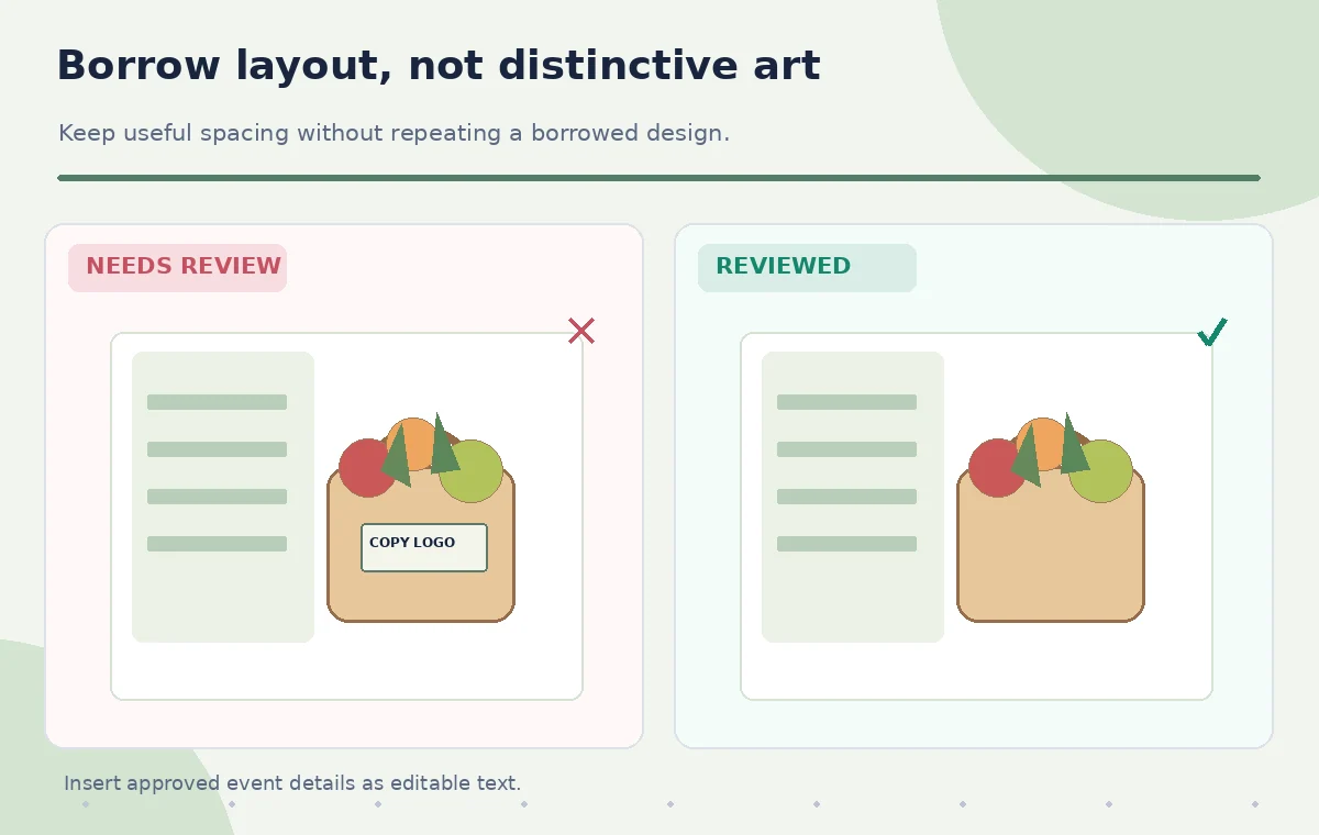
Look specifically for unusually repeated contours or placements from an outside reference image. A resemblance in overall two-column structure is different from copying a recognizable photograph, proprietary logo, or highly distinctive arrangement. The decision is editorial and legal as well as visual. When authorization is unclear, replace the source with an organization-owned drawing before generating anything for publication.
Compare copied details with original alternatives
Create a simple before-versus-reviewed illustration. The problematic candidate repeats a reference object’s distinct silhouette and includes a lookalike sponsor mark. The reviewed version uses an original produce arrangement that preserves only the functional left-text/right-art division. This conceptual comparison does not claim to be the output of a specific Firefly model; it explains the kind of review a designer should perform.
Inspect the proposed background on a narrow mobile canvas and an ordinary poster aspect ratio. Text-safe space should survive cropping; if a corner is visually crowded, reject the image or adjust the layout. Avoid resizing a generator’s content until it distorts the bag or creates double objects. Better to select a clearer variation than to patch a confusing illustration with more unverified generative edits.
Keep facts and sponsor branding outside the generator
Add the date, address, eligible donation items, collection hours, and partner logos using the poster editor’s normal text and asset tools. Confirm each item against the approved pantry notice. Designate someone to proof the address and drop-off instructions. Generated image text should not be mistaken for authoritative event details, even when the letters seem plausible at a glance.
Use official logo files supplied by partners and keep adequate clear space around them. If the sponsor relationship has not been approved, omit the mark. Do not infer a charity endorsement from a generated visual. The poster should have accessible contrast, readable type at print size, and a clear path for people who need alternate formats or directions.
Check rights and use terms for both inputs and outputs
Verify that the uploaded composition reference is yours or appropriately licensed, and check the current terms for the generator and the selected model. A permitted upload does not automatically make every generated result safe for any commercial use. Avoid exposing private donor information in reference files. Save notes about the source’s ownership and intended uses with the final design.
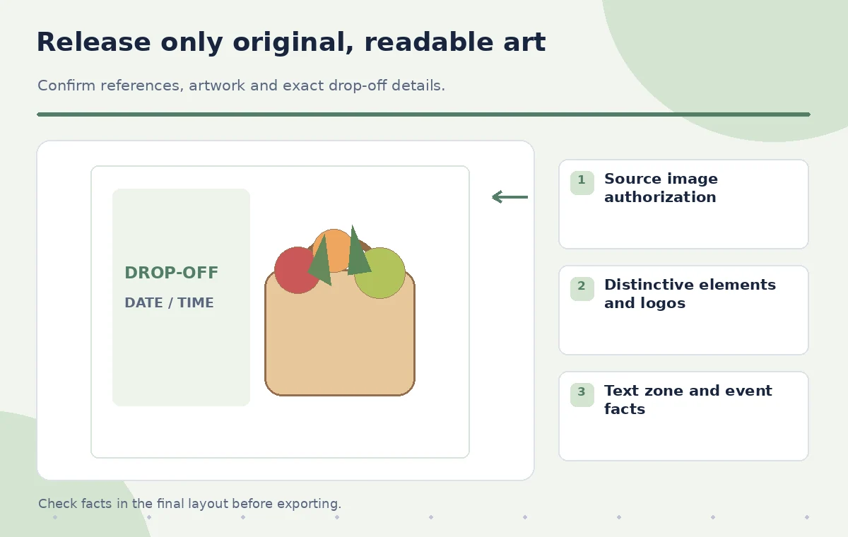
Treat visual similarity review as a separate step from spelling and accessibility review. A poster can be technically legible yet uncomfortably close to another campaign. Conversely, an original illustration can still be wrong if the address or collection date is incorrect. Ask a designer to review originality and a pantry organizer to check factual details before releasing the artwork.
Export a documented, editable poster
Keep the chosen generated image in a layer separate from final text, logos, and call-to-action. Produce print and mobile variants and check that the focal produce, headline, address, and drop-off hours remain visible in each. Save the initial sketch and approved copy so the campaign can be refreshed next year without carrying over obsolete dates or accidental layout imitations.
The illustrations in this article are original teaching diagrams, not Firefly screenshots or measured model comparisons. The verified claim is that Adobe documents a composition-reference workflow with a Strength control, not that it can guarantee originality or correct event signage. Human review of permissions, visual resemblance, and operational details is the release gate for every poster.
How We Research
We reviewed named primary product documentation for the described feature, current interface, and limitations: Adobe Firefly: Match image composition to reference image, Adobe Firefly: Composition on mobile. Our method compares official functionality with a fictional editorial task, defines specific failure states and independent checks, and keeps source records separate from AI-generated content. We did not access a live account, run an API test, measure model accuracy, or examine real participant data for this article. Interface labels, usage limits, credits, and eligibility can change; confirm the current product documentation and account terms before work. Every illustration is instructional art rather than a screenshot or measured before-and-after result.
Frequently Asked Questions
No. Composition concerns arrangement and structure; style concerns appearance. Choose the control for the actual goal.
Only if you have appropriate rights and an acceptable use case. An organization-owned layout sketch is safer.
Do not rely on generated lettering. Add verified details as normal editable text layers.
No. It guides adherence, and outputs still need human inspection for cropping and originality.
No. Review source permissions, model terms, resemblance to outside artwork, legibility, and event facts.