
Adobe Firefly offers two related but different image-reference controls: Composition for arrangement and outline or depth relationships, and Style for the appearance of the output. Mixing them up can waste iteration on a marketing hero where the product must sit on one side and the headline will go on the other. This guide uses an imaginary reusable water bottle and a simple landscape hero to show how to define the layout, tune the mood and review the final asset. The diagrams are original conceptual explanations, not screenshots or measured Firefly results.
Write a layout requirement separately from an aesthetic requirement
The page layout needs a clear area for real text, a product silhouette that is not covered by the CTA and a composition that crops well on phones. Those are spatial constraints. The visual mood might call for warm sunrise light, muted earth tones and a soft paper texture. Those are stylistic constraints. Write two separate briefs so a creative reviewer can say precisely what failed. A beautiful photo with the bottle covering the headline area fails the layout brief even if the palette is excellent. Conversely, a perfectly placed object with a harsh glossy look may fail the desired brand mood.
Use Composition to guide the geometry of the hero
Adobe describes Composition reference as a way to guide arrangement, outline and depth using an uploaded or gallery reference. In Firefly Image generation, the Composition section offers a reference upload and a Strength setting that governs adherence. Make a simple reference drawing with the bottle on the right third and open space on the left. Use that as the composition cue, then prompt for the desired scene. This does not mathematically lock coordinates or guarantee brand-product identity, so compare the generated silhouette with the approved layout. Review the specific model selected because Adobe warns that image-generation settings can differ by model. For the source-specific control described here, consult Adobe’s composition reference guide.
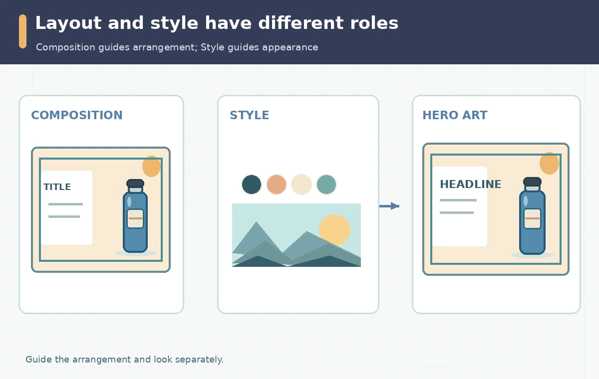
Use Style to guide color, texture and lighting
In contrast, Adobe’s Style reference is aimed at an existing image’s overall look and feel. Use an authorized image showing the desired earthy palette and soft lighting; avoid making the reference a photograph of someone else’s trademarked product. Choose a style source that is easy to discuss: watercolor wash, grainy illustration or diffuse studio light. The Style Strength control influences resemblance to that reference. Do not assume it will preserve object placement. A style can overpower a straightforward product message when excessive texture erases the negative space or low contrast compromises legibility. For the source-specific control described here, consult Adobe’s style-reference instructions.
Run a three-state comparison to isolate the cause of errors
Create a controlled editorial review table with three planned conditions: text prompt only, the same text plus Composition, and the same text plus Composition and Style. Keep the aspect ratio and model constant. This is a recommended test plan, not a report of results we personally measured. Record what changes in object placement, horizon line, palette and text-safe region. If layout improves only with the composition cue, that explains which control helped. If the style image moves the subject or distorts the bottle, refine the brief or reduce influence before judging a candidate final.
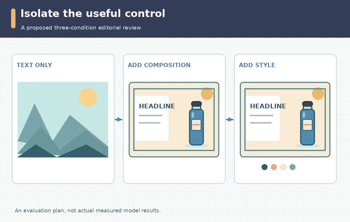
Choose strength based on the risk of layout drift
Both Composition and Style reference interfaces document adjustable Strength. Think of them as separate creative controls rather than a universal quality dial. For a carefully designed advertisement, preserve the headline area first; for a blog illustration, a more flexible scene may be fine. Use representative low, medium and high settings as experiment labels, but do not invent outcomes or numerical effectiveness percentages. Capture the selected settings in the production notes and state whether the audience will see an illustration or a representation of an actual product. If a generated object differs from the merchandise, use a real approved product layer instead.

Proof a finished hero after adding real typography
Generated illustration comes before production copy. Add a properly typeset headline and CTA in the website or design editor so legal wording, prices and accessibility labels remain editable. Check the safe area at desktop width and a narrower phone crop. Verify contrast with the background, visible focus and whether the product illustration competes with the page’s most important action. For ecommerce, do not imply that AI-generated materials, sizing or accessories represent the purchased item unless that depiction has been independently approved. Retain the original product photography as the record of what actually exists.
Archive sources and constraints for later campaign updates
Preserve the layout sketch, style source permission, prompt, selected model, reference strength choices, approved image and final annotated page mockup. Note the review date and recheck Adobe help when features change. In a new campaign, the same layout reference may still work with a different style image, or the brand may keep the same style while moving the product. Keeping the two sources distinct makes those revisions deliberate. The goal is a reproducible design decision and truthful marketing image, not a claim that generative output is pixel-perfect or contractually cleared for every use.
How We Research
We checked Adobe’s Composition reference instructions, Style reference guide and Text to Image settings on October 28, 2026. The bottle hero and three-condition plan are examples for editorial instruction; no Firefly account test was carried out. The supporting diagrams are conceptual and do not imply a vendor UI, our original test, an approved endorsement or a measured quality score.
Frequently Asked Questions
No. Composition guides arrangement and depth; Style guides aesthetic features such as visual texture and mood.
A composition reference guides placement but does not guarantee pixel-perfect geometry or product accuracy.
Adobe documents both controls in its image-generation workflow, though availability can depend on the chosen model.
Use editable webpage or design text for critical headlines, buttons, prices and other exact wording.
Keep the composition sketch, style source and rights, model, prompt, strength selections and approved final crop.